June 8th, 2023
Volume 56
Client
Various
A powerhouse trio of projects exploring the exciting life of a bodybuilder turned actor turned politician, the history of American objects and places, and a global journey through food.
get to da choppa
Arnold
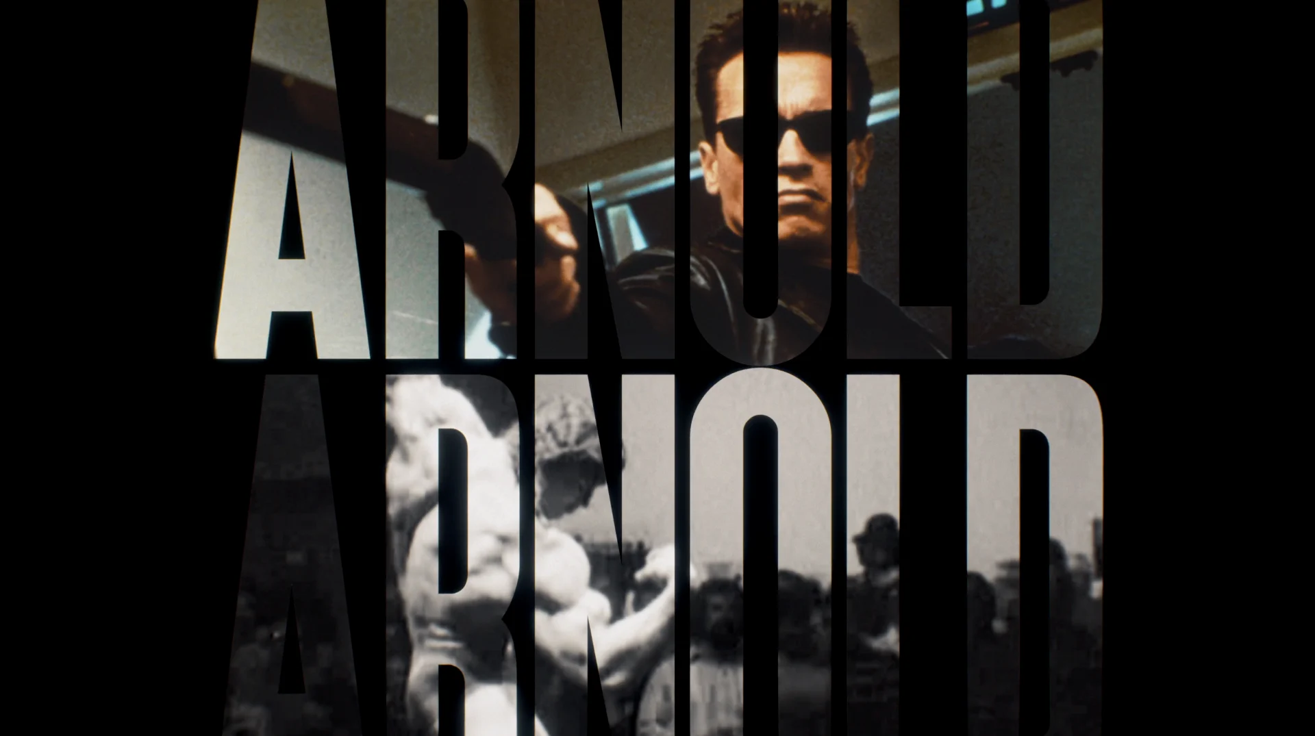
Director Lesley Chilcott is a longtime partner of BGSTR’s, most recently collaborating on the series design for Helter Skelter, and we joined right at the start of this project to assist the team in chronicling Arnold’s journey from the countryside of Austria to an American celebrity and politician. Our early entry to the project allowed us ample time to explore design directions and play around with various elements.
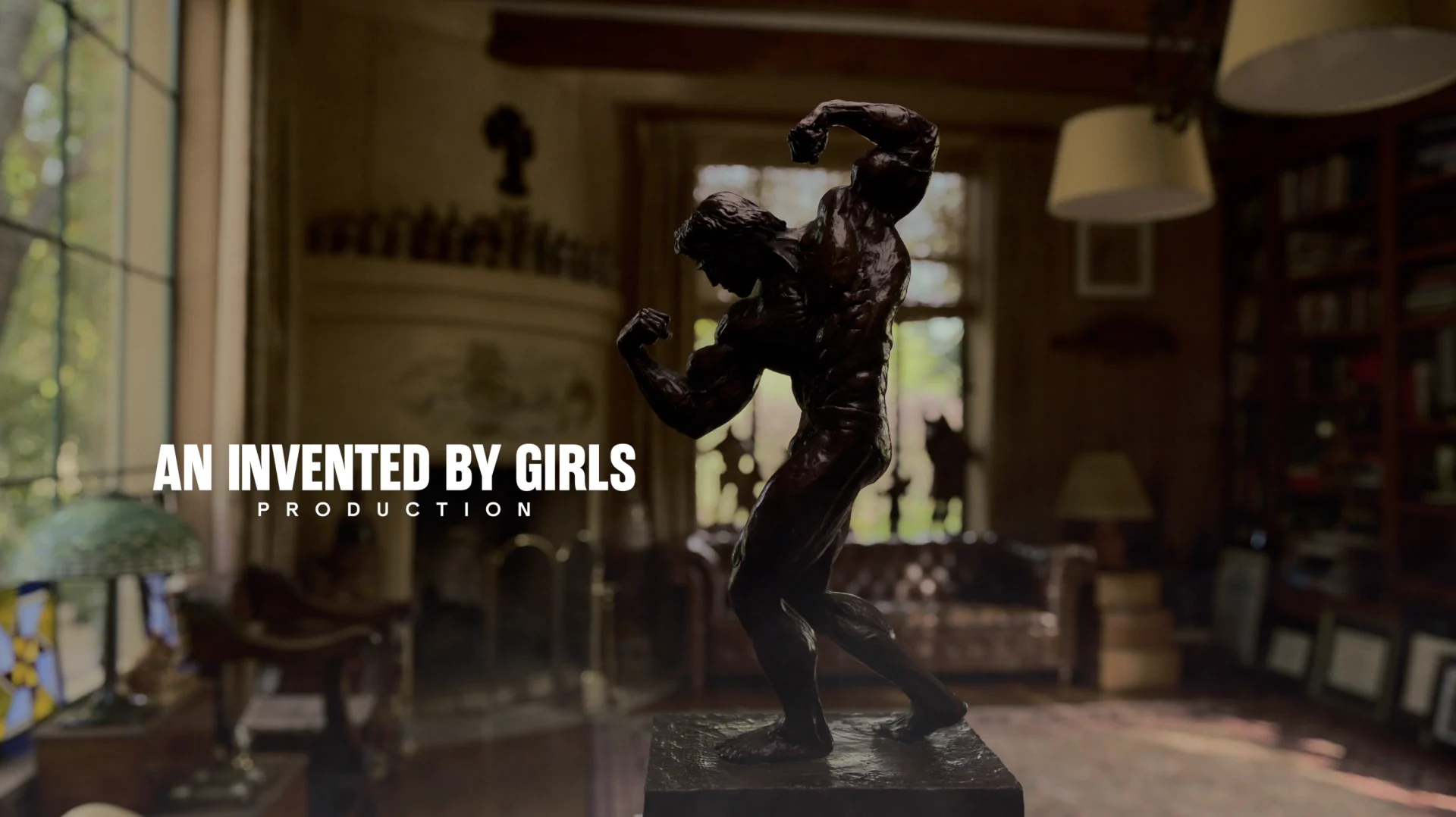
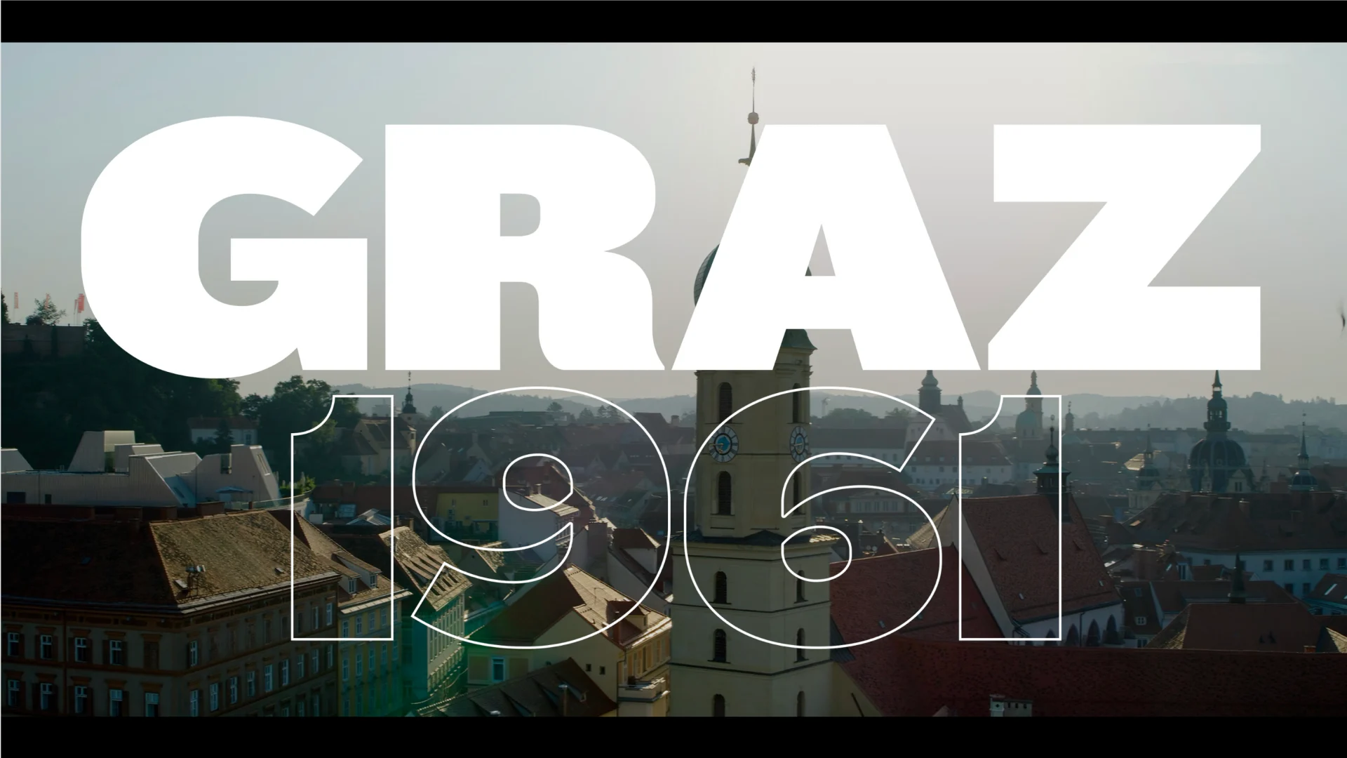
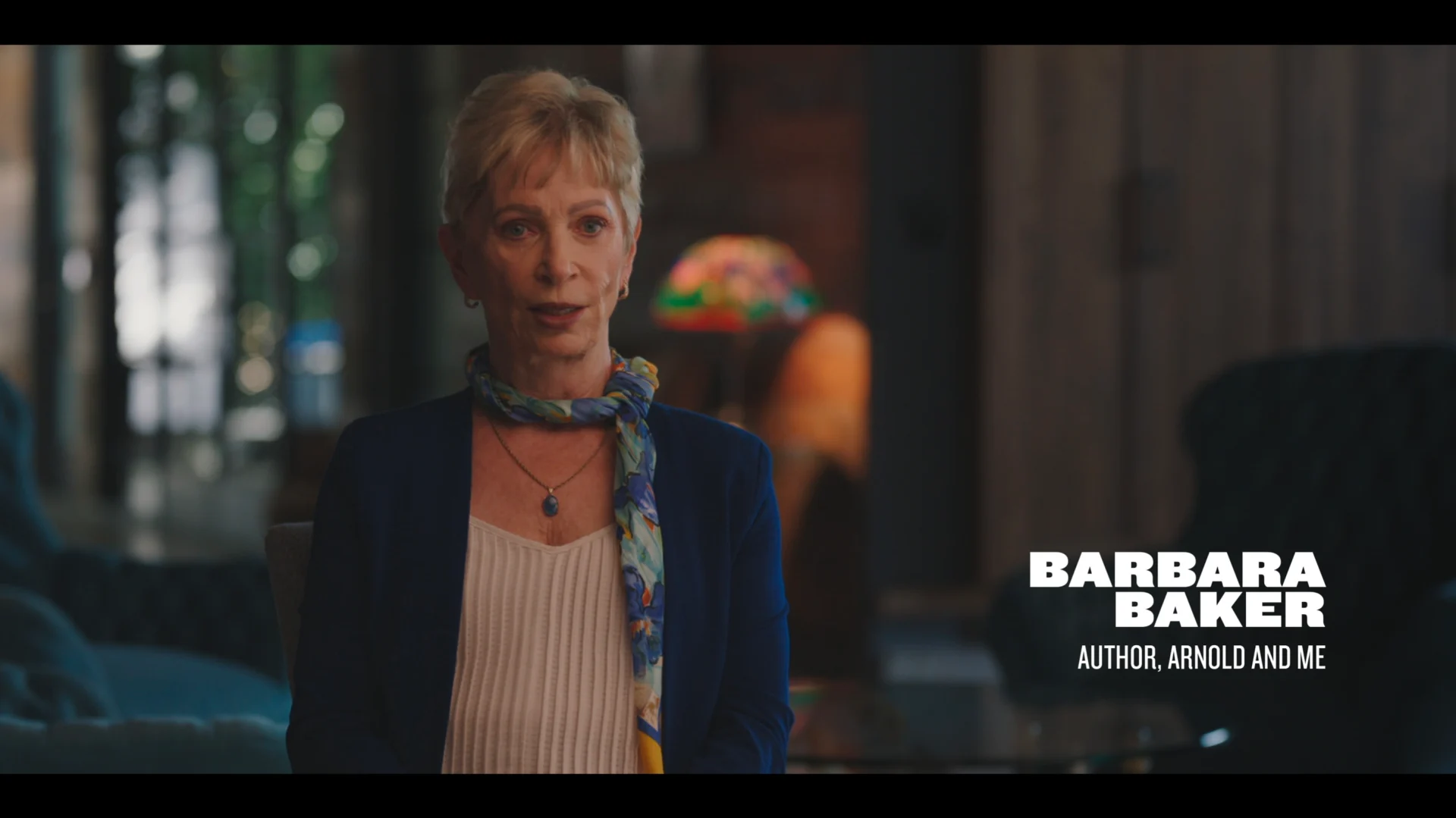
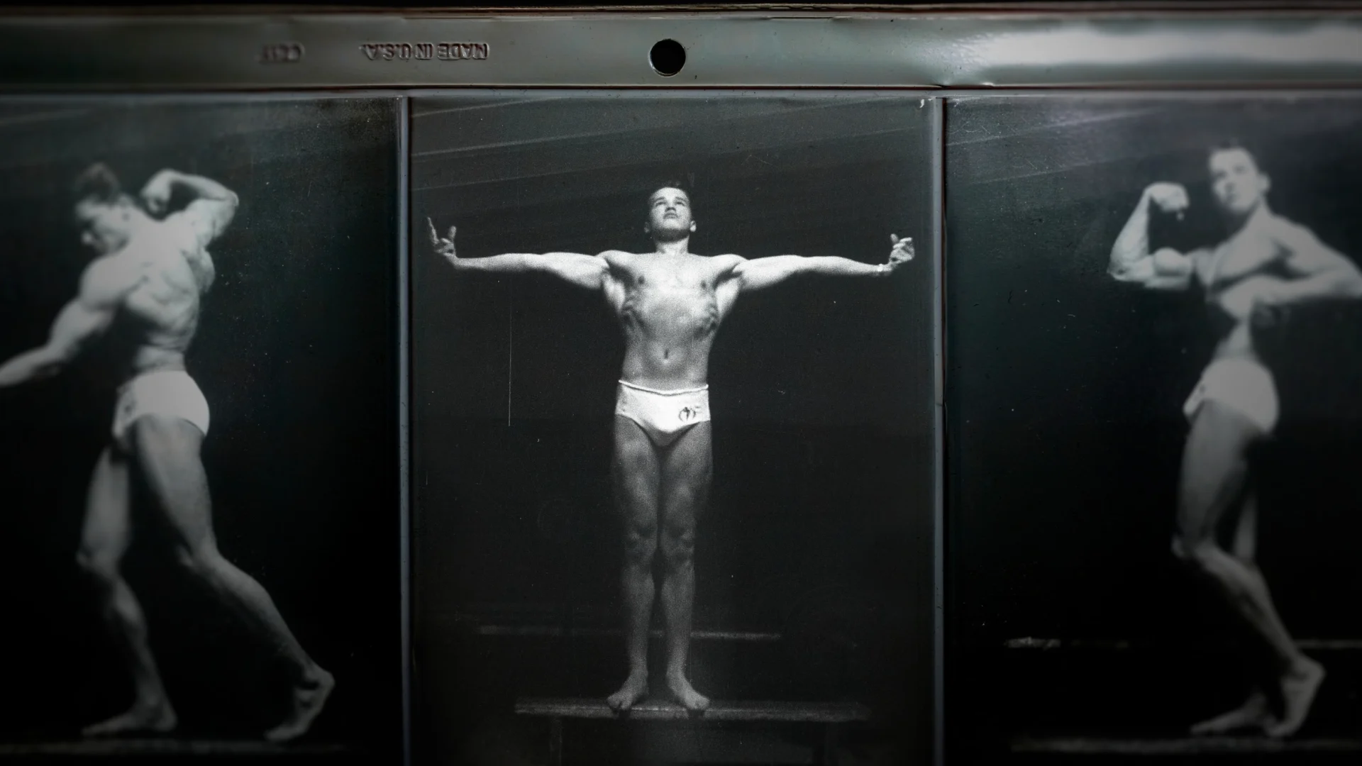
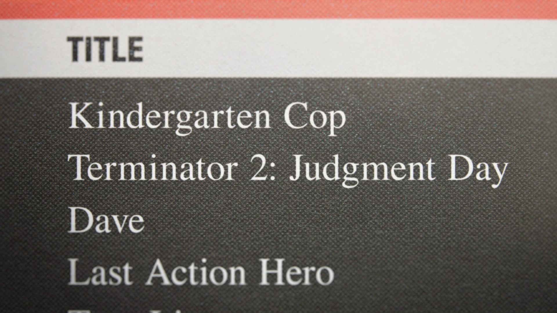
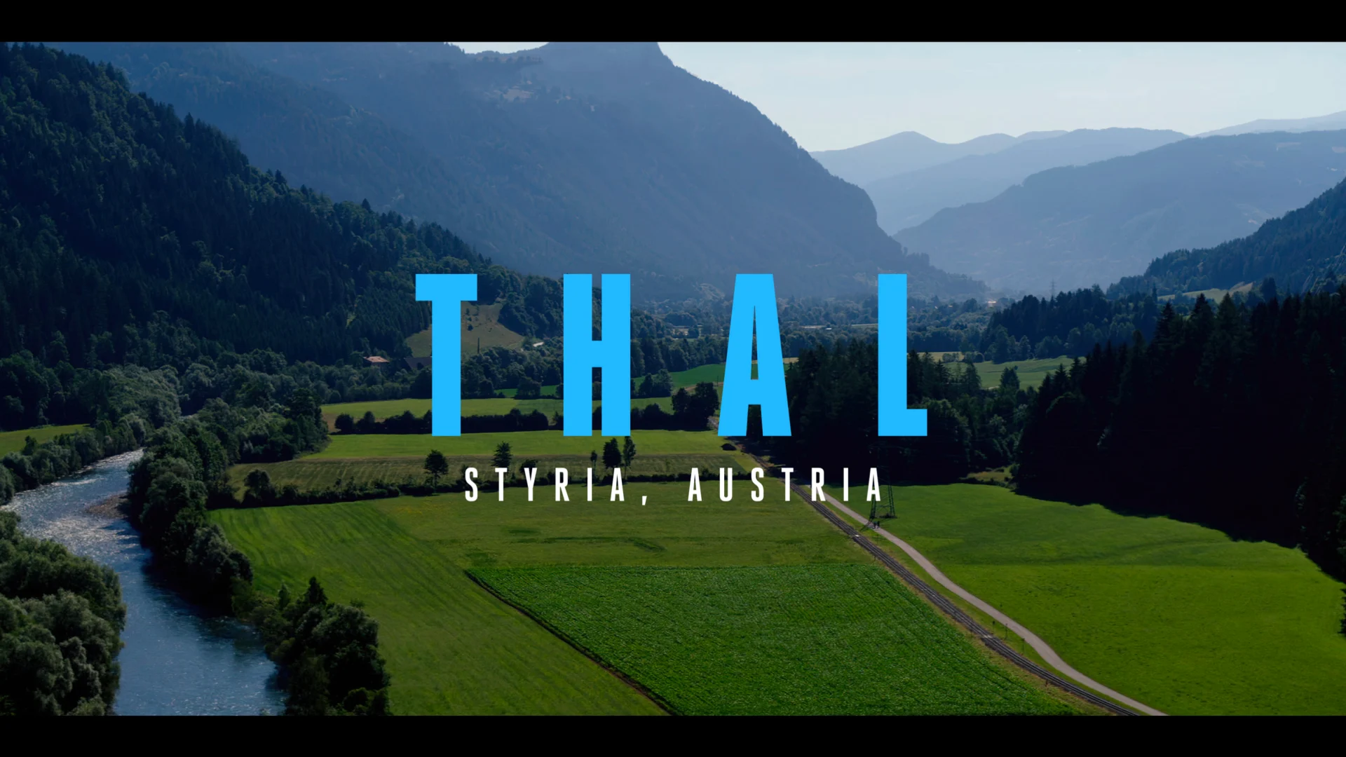
We played with type, explored transitions and chapter cards, and tried out different aspects for a single episode until we were able to creatively land on something that was working and felt on par with Arnold and his oversized persona.

The design style we landed on feels very suited to Arnold; it leans in to his personality as a whole but also his brand. The series is divided into three episodes, each reflecting one of Arnold’s eras— bodybuilding, acting and politics. The animation language stays generally the same across episodes, but modernizes across the eras.

For episode one, covering Arnold’s early history and bodybuilding career, we designed with bold type and flashy animations. We treated a lot of photos and early competitions and wanted to keep the animation punchy and upbeat, channeling the feel of a sports documentary.
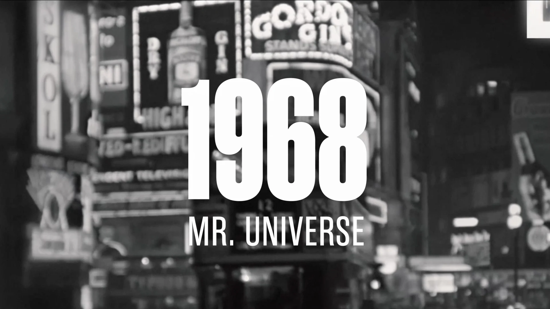
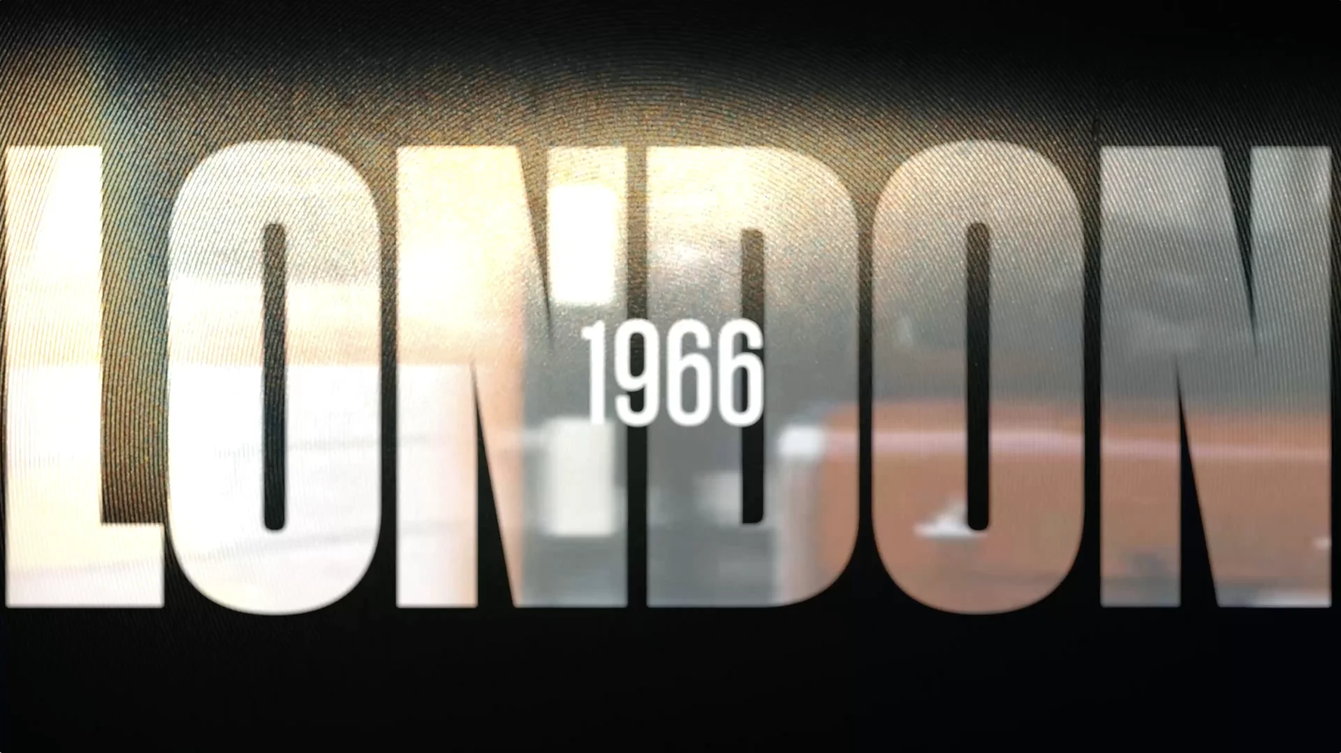
As part of the series design, we also designed the main title sequence which is a full minute for the first episode and then a main title sting for the next two episodes. Arnold’s personality is the key influence in all of the design, and his bold and commanding presence comes through loudly in the title sequence.

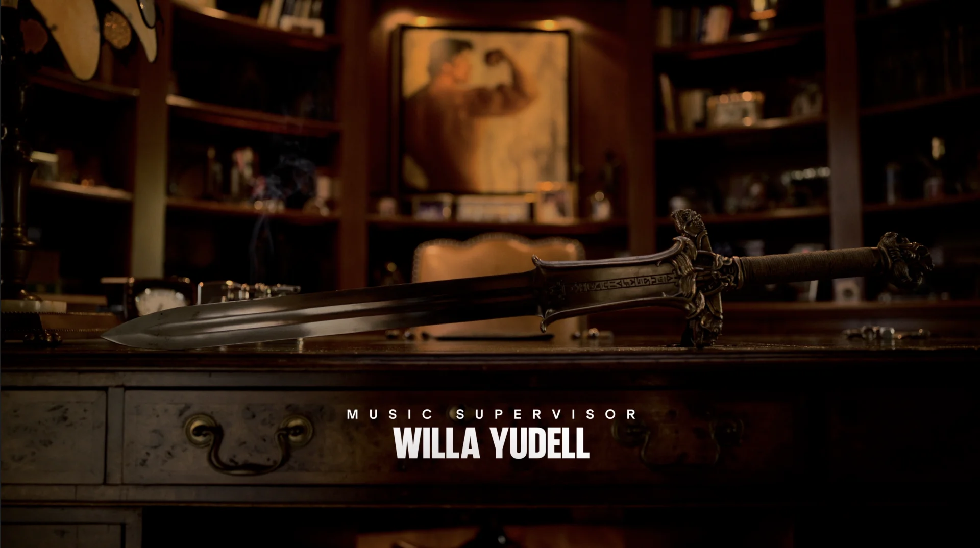
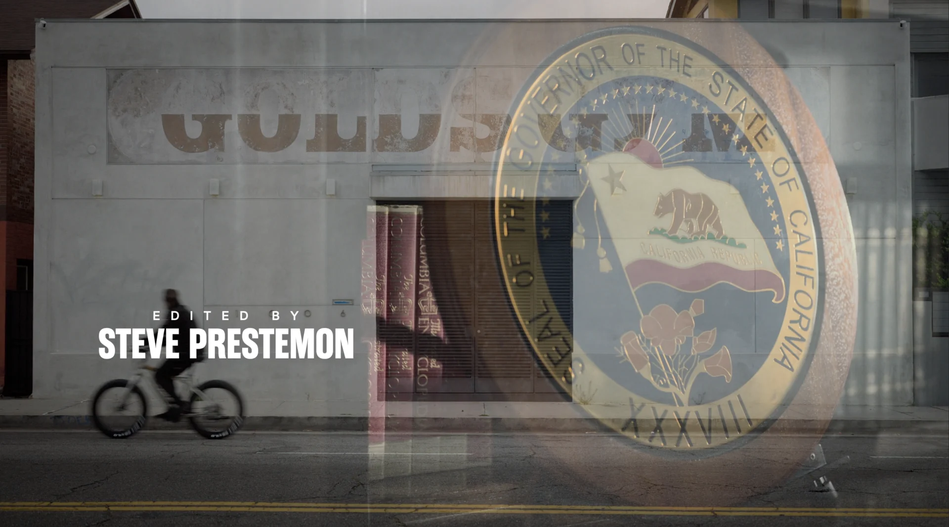

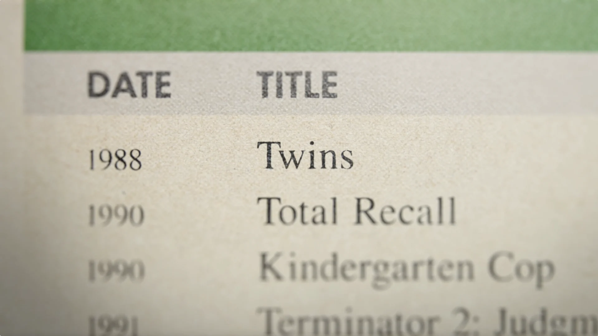
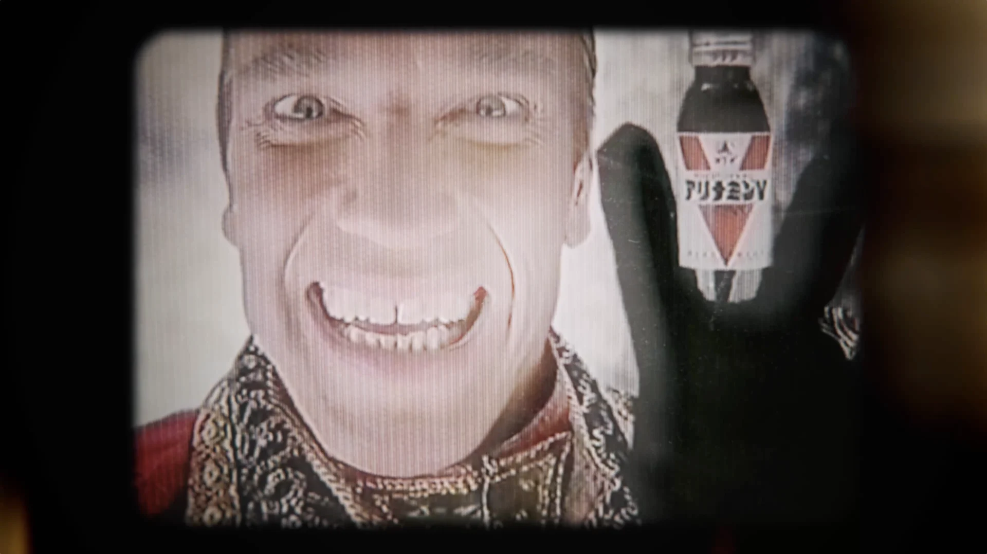

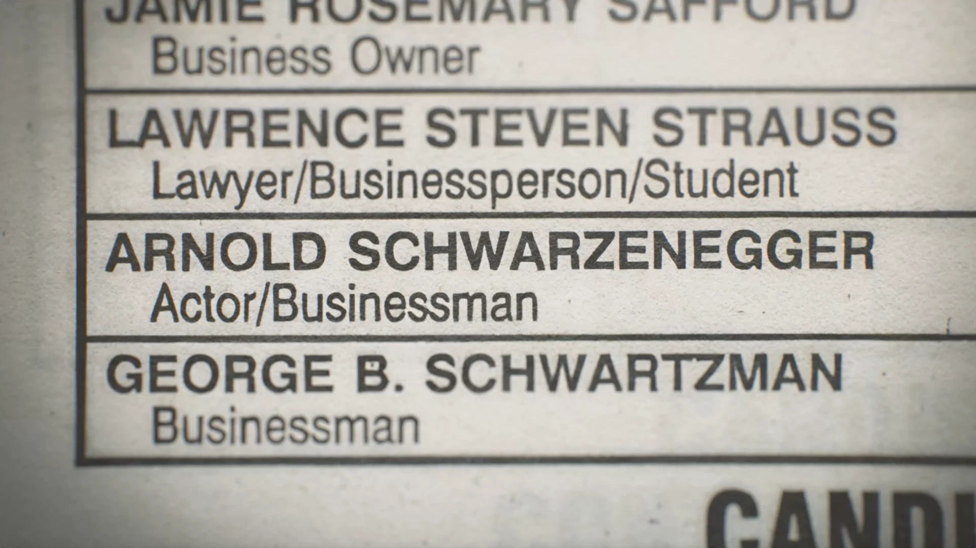
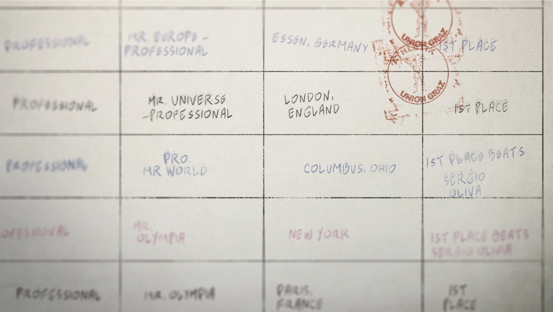
This project was an exciting one throughout thanks to the vast amount of archival we had to work with, thanks to both the public and Arnold himself. Photo treatments, documents, headlines, footage treatments and mortises, international posters, and quite a bit of family photos and personal accoutrements as well.
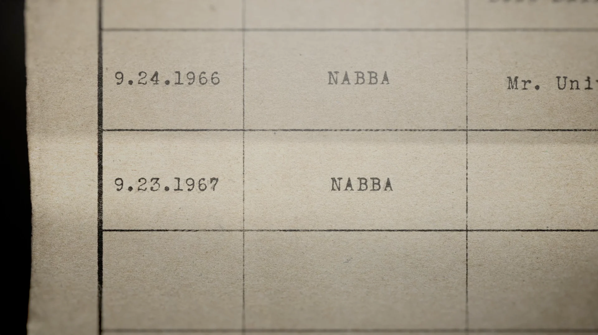
To complete the series, we included a bespoke piece for each episode. A weightlifting passbook for the first episode, box office treatments for his films for episode two and an election ballot for the third and final episode covering his political career.
The project was expansive, and we worked closely with the production team including Chilcott and also Allen Hughes throughout. Our great working relationship really empowered us to push the design to a premium level, adding lots of layers and pushing the envelope with how much energy we could infuse. The blend of punchiness and oversized elements really cements a design that was built around Arnold’s massive personality and charisma, grounding a documentary that is sure to be an instant Netflix classic.
Not another B movie.
symbols and stories
Iconic America with David Rubenstein
ICONIC AMERICA: OUR SYMBOLS AND STORIES is an 8-episode nonfiction series from PBS that examines the history of America through some of its most iconic symbols, objects and places, diving deep into each symbol’s history and how its meaning has changed over time. BigStar partnered with the series’ creators to design the series and graphically assist the storytelling around these iconic symbols and how they can be used as a gateway to understanding America’s past and present.
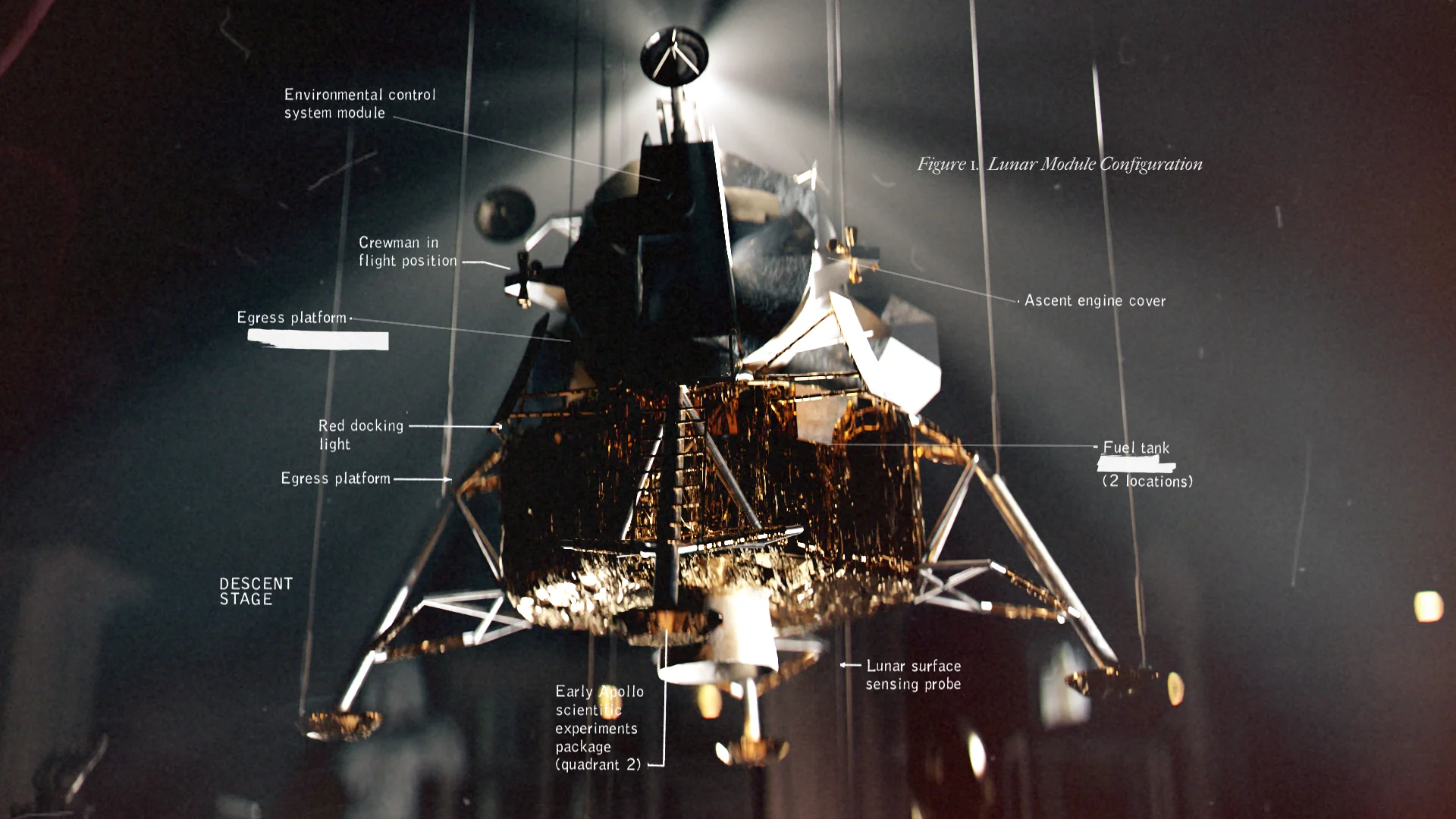
The design for this series was a unique ask— we were brought in to treat the entirety of each episode including photography and archival, so this was a big lift. Our goal was to collaborate with the show’s creators in a way that defines a really smooth workflow for everything and incorporates a cohesive design look across the series.
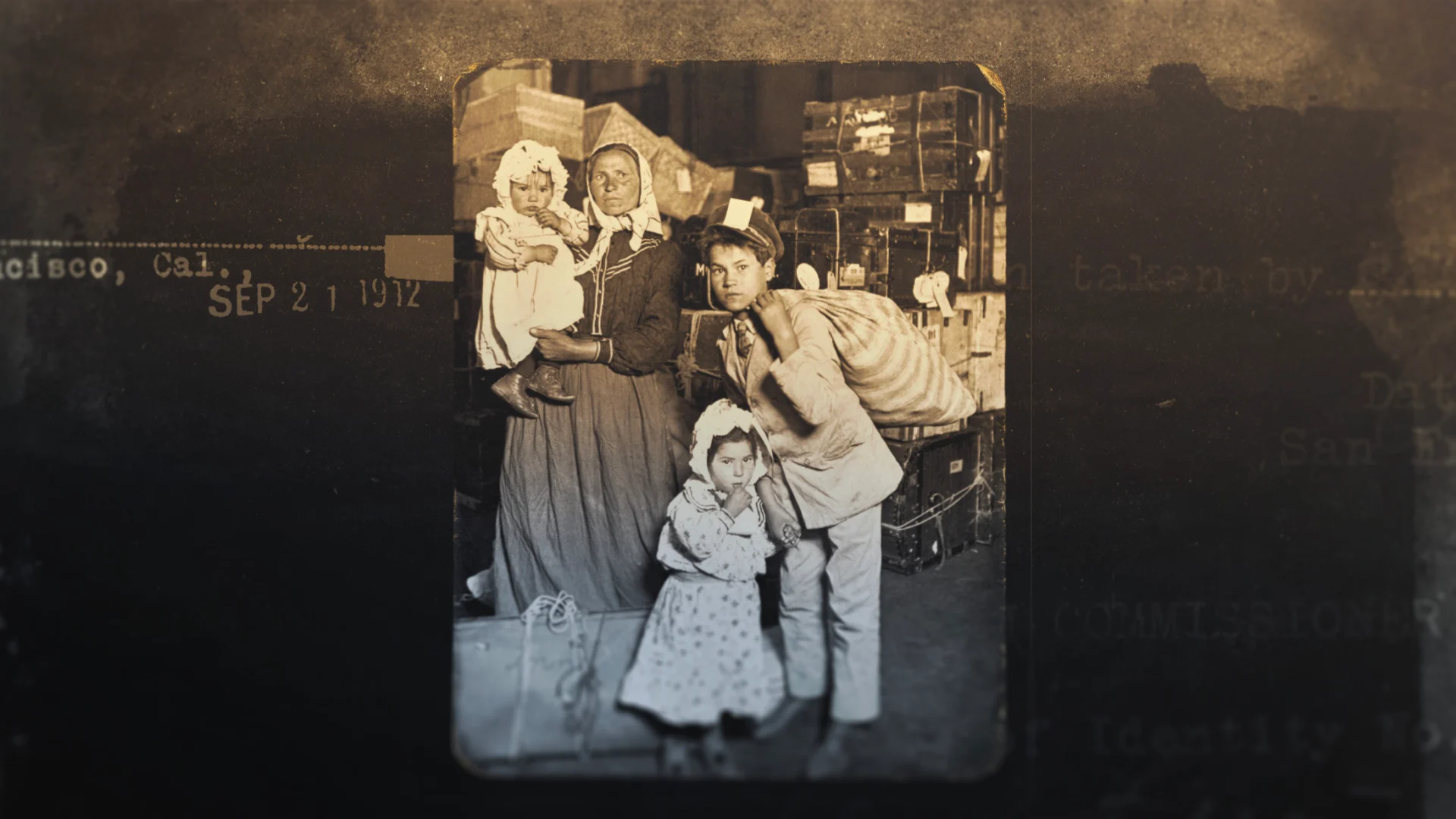
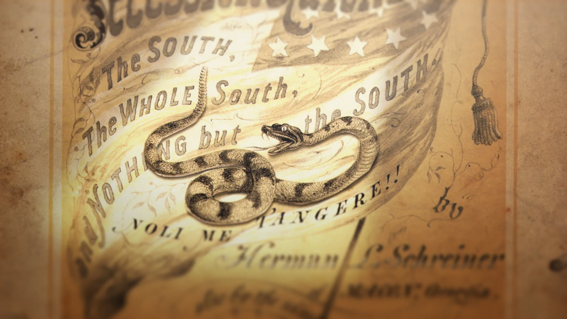
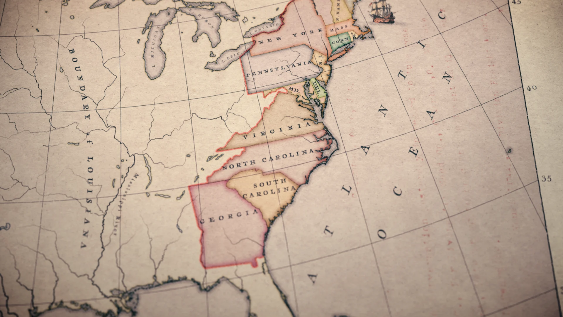
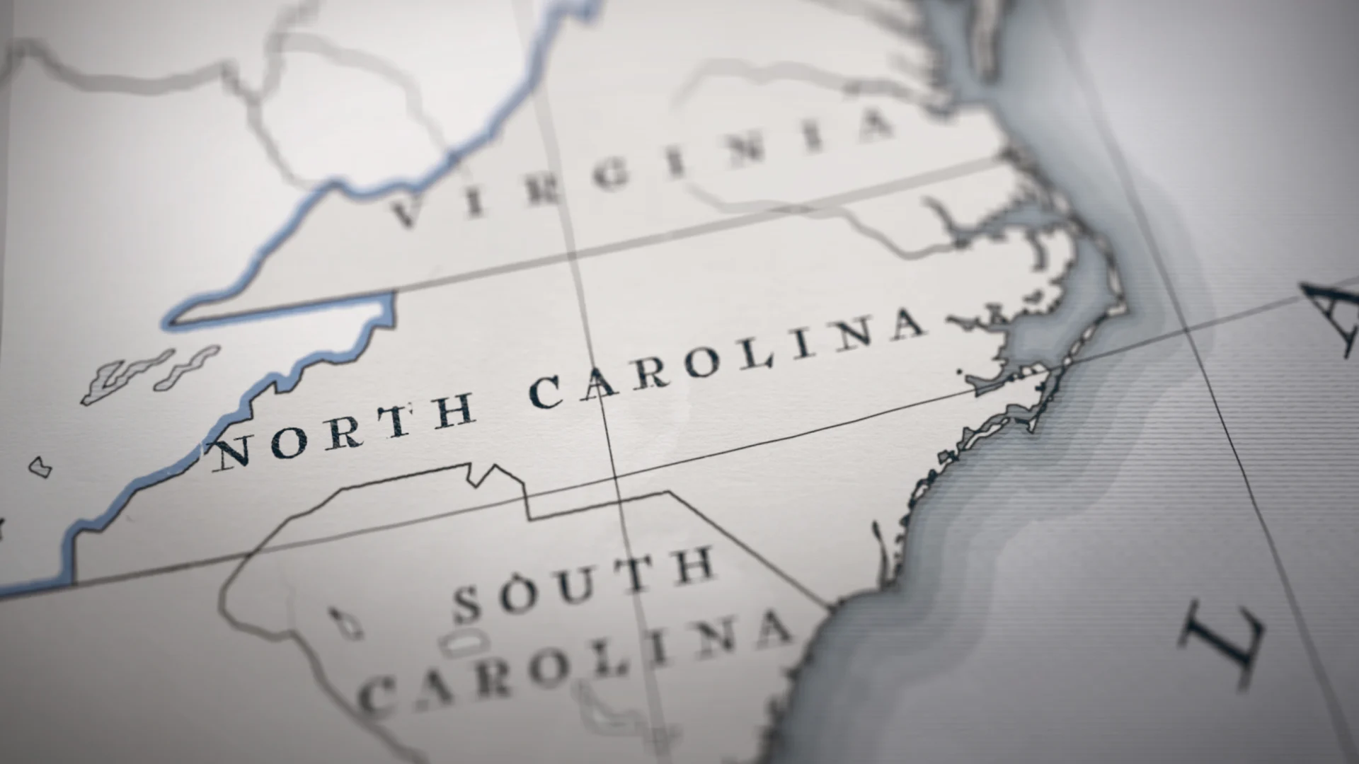
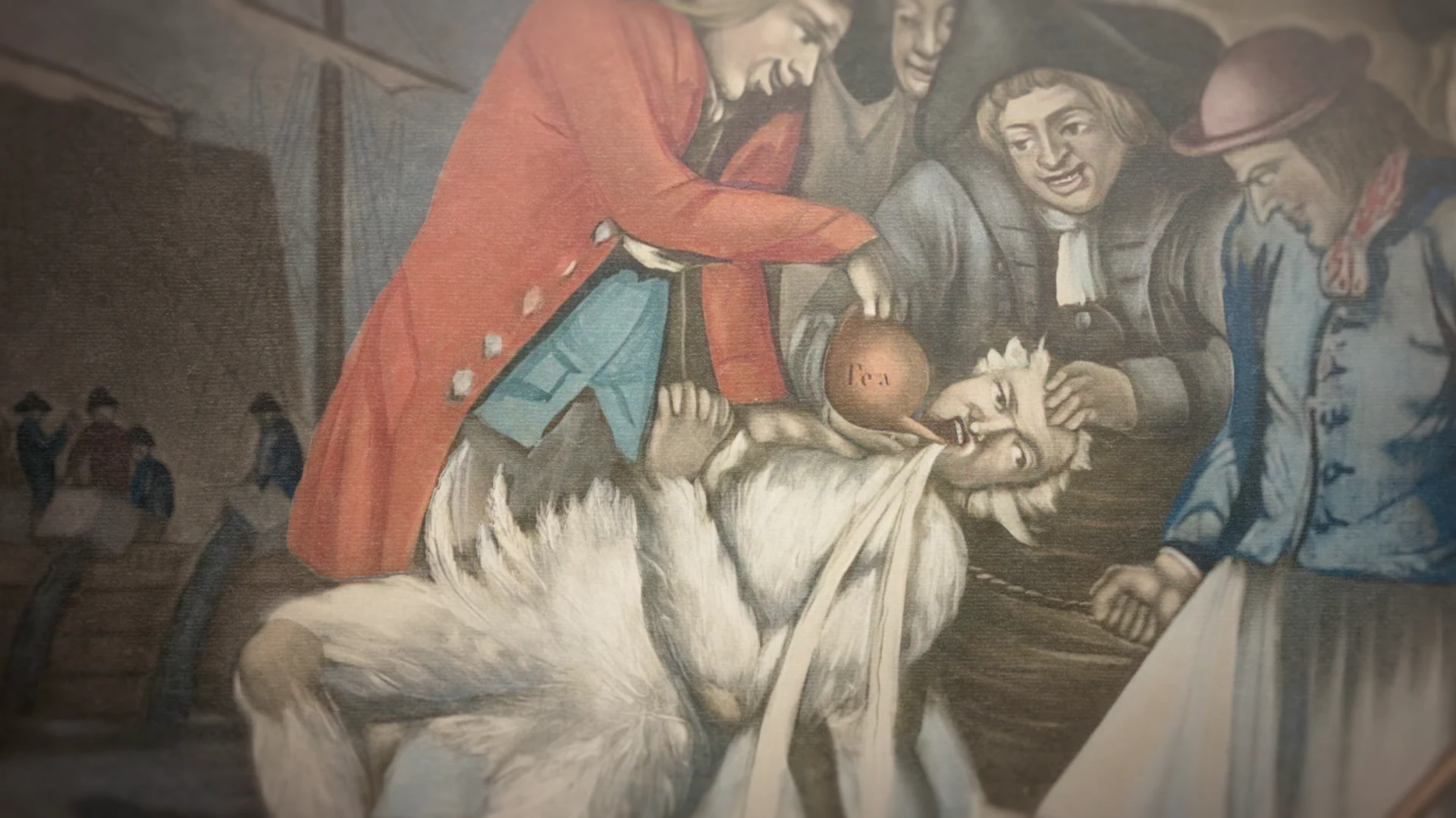
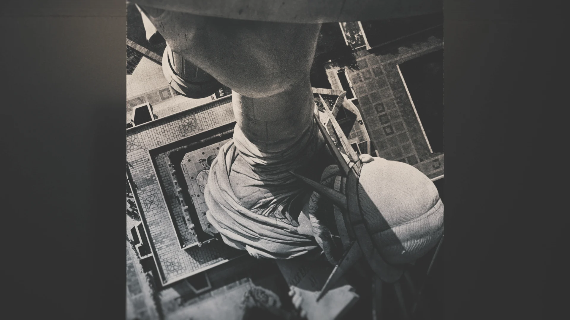
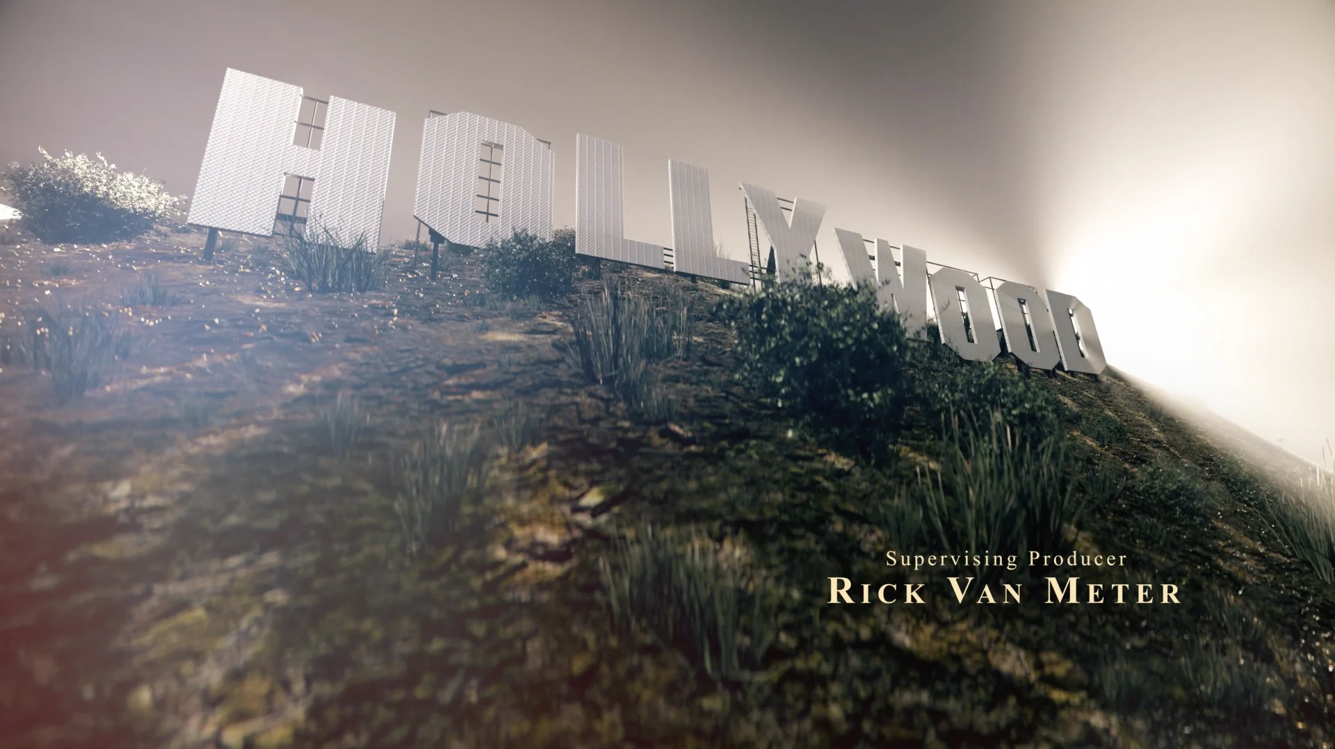
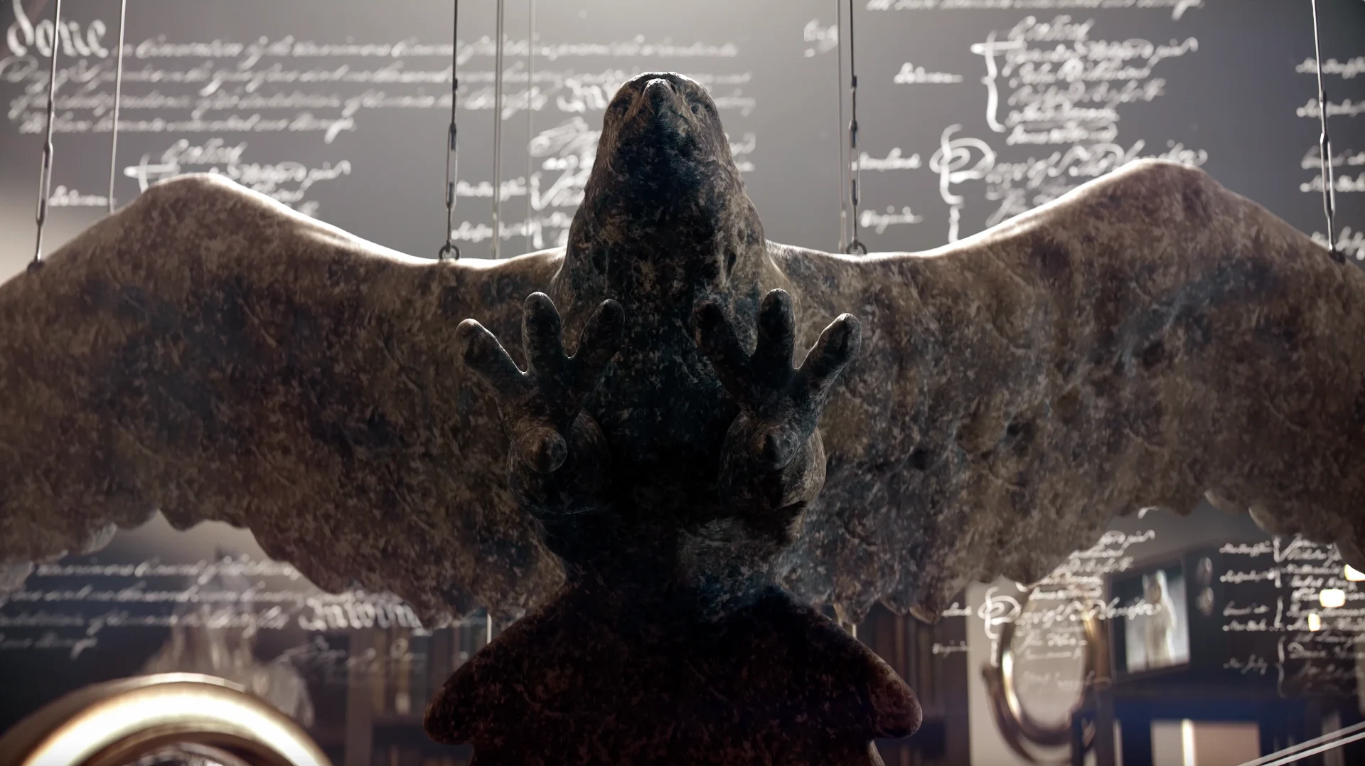
In each episode, host David Rubenstein — co-founder of the Carlyle Group, acclaimed philanthropist, and lifelong student of history — explores a symbol from history. From flags and statues to revered landmarks, objects that people live alongside and interact with history every day. Whenever we were introduced to a new episode, we would meet that team and talk through the specialized graphics.
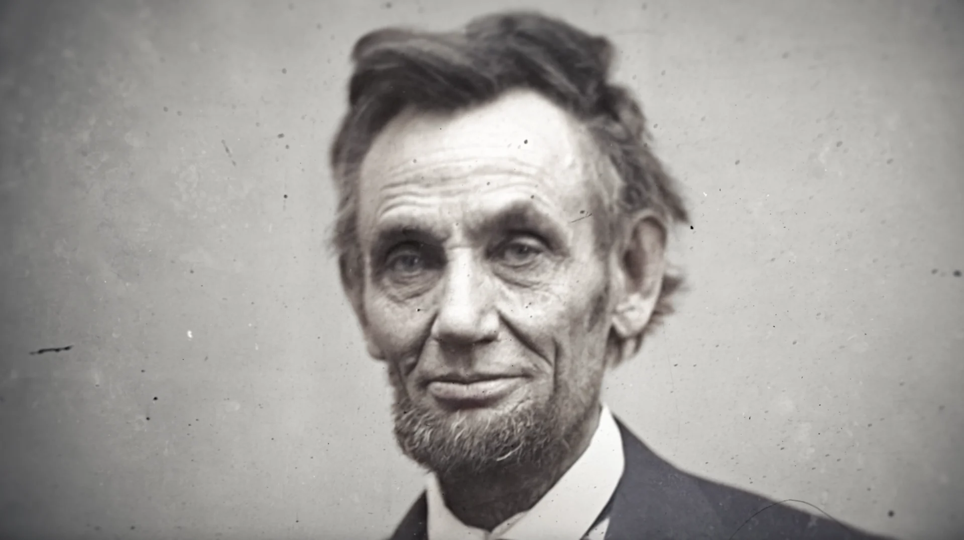
For each episode, we separated the work into specialized buckets vs general archival depending on the needs of the material. The look for simpler archival treatments was established early on and streamlined throughout the series. There were also a handful of more in depth explainers and 3D work required for each episode that we were able to dive into in tandem - these graphics called for a more custom touch, depending on the episode subject matter.
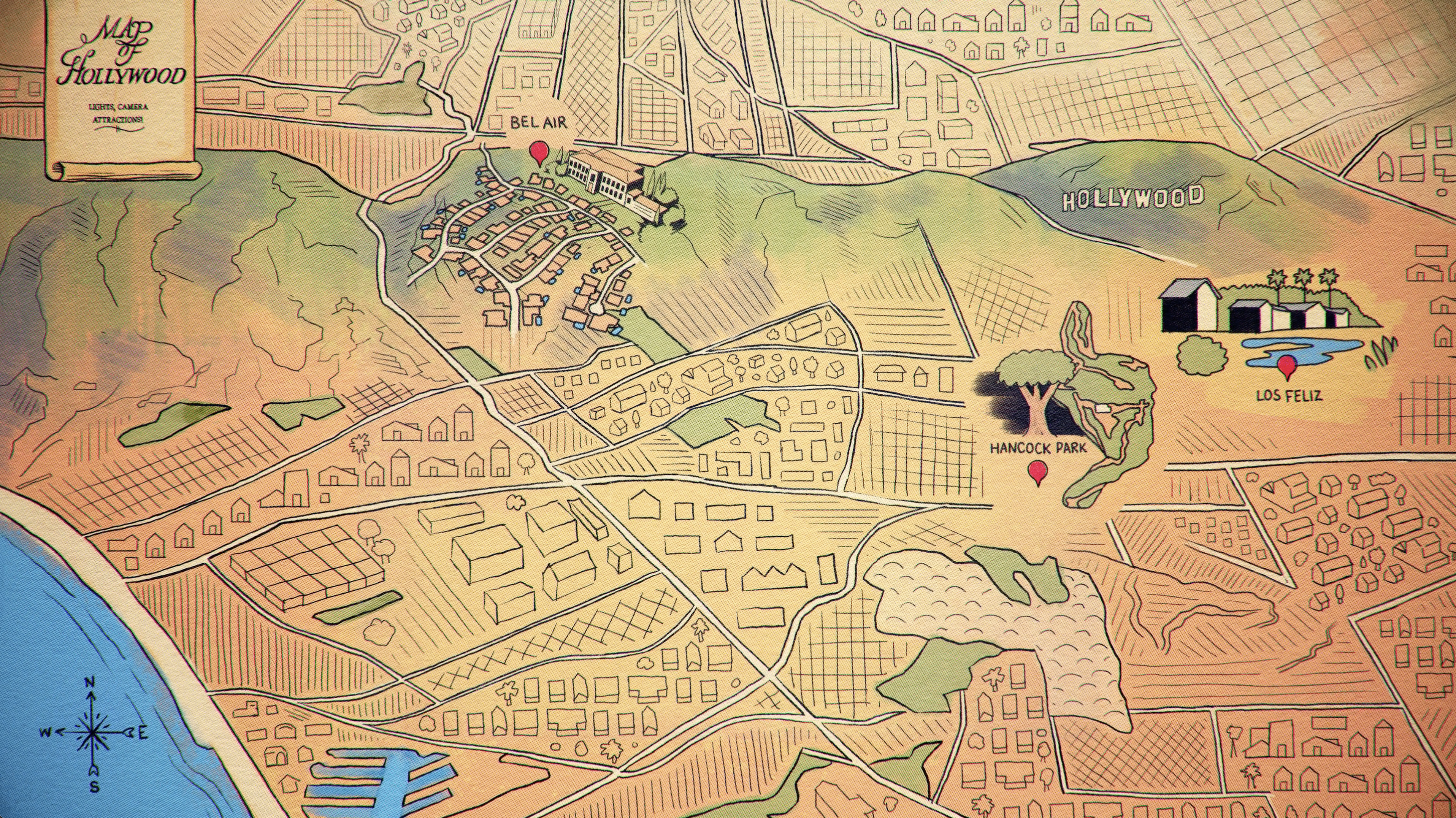
Some of the heavier treatments were parallax photos, where you separate the foreground for the background, and there's a little more movement to it all and some were fully 3D. These specialized graphics really ended up keeping the design fresh for each episode because we covered such a wide array of objects.
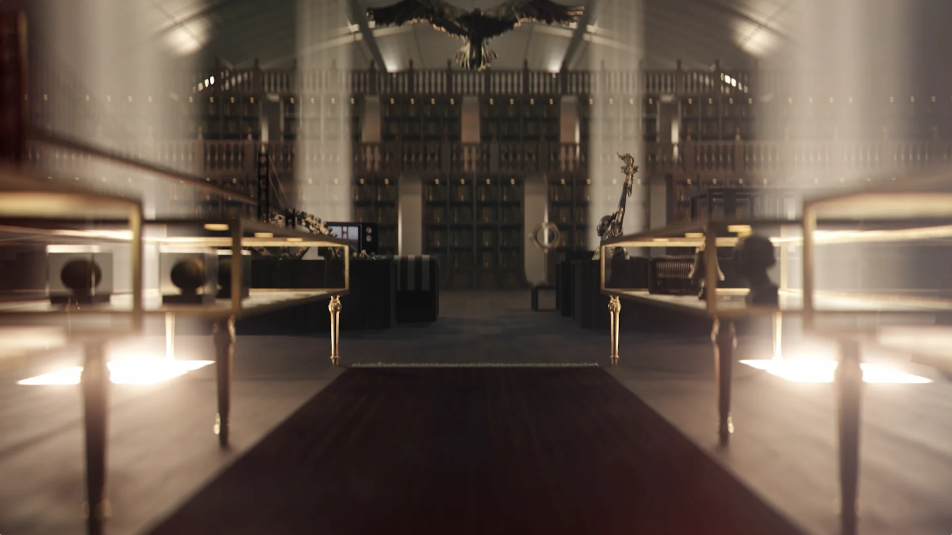
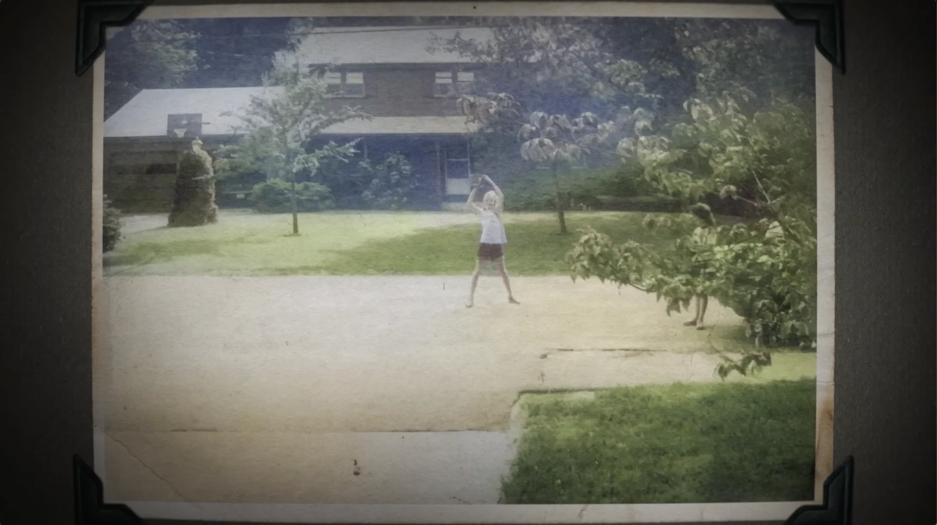
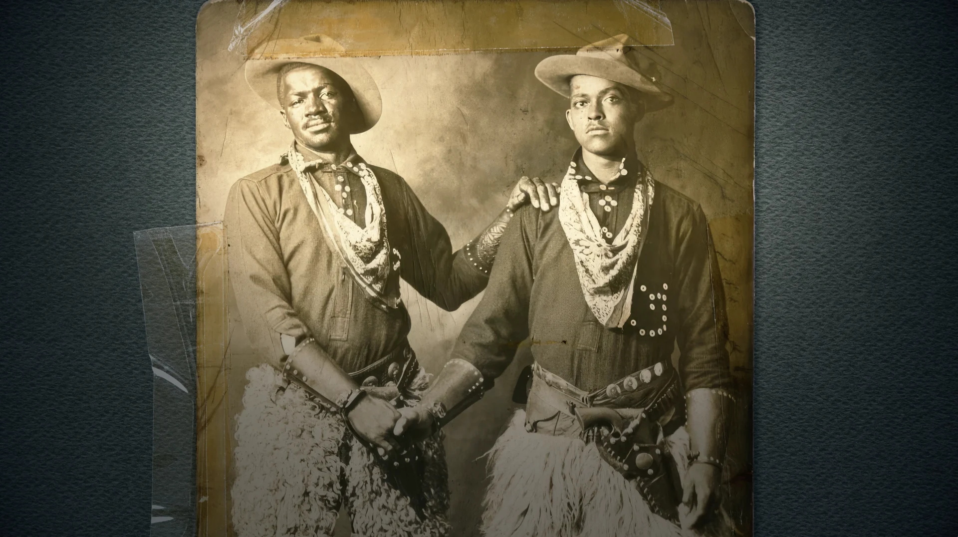

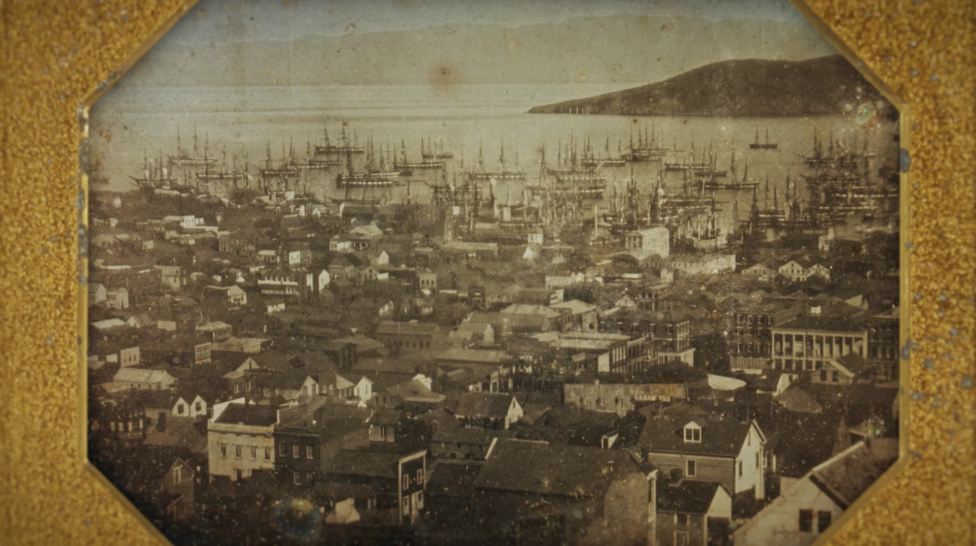
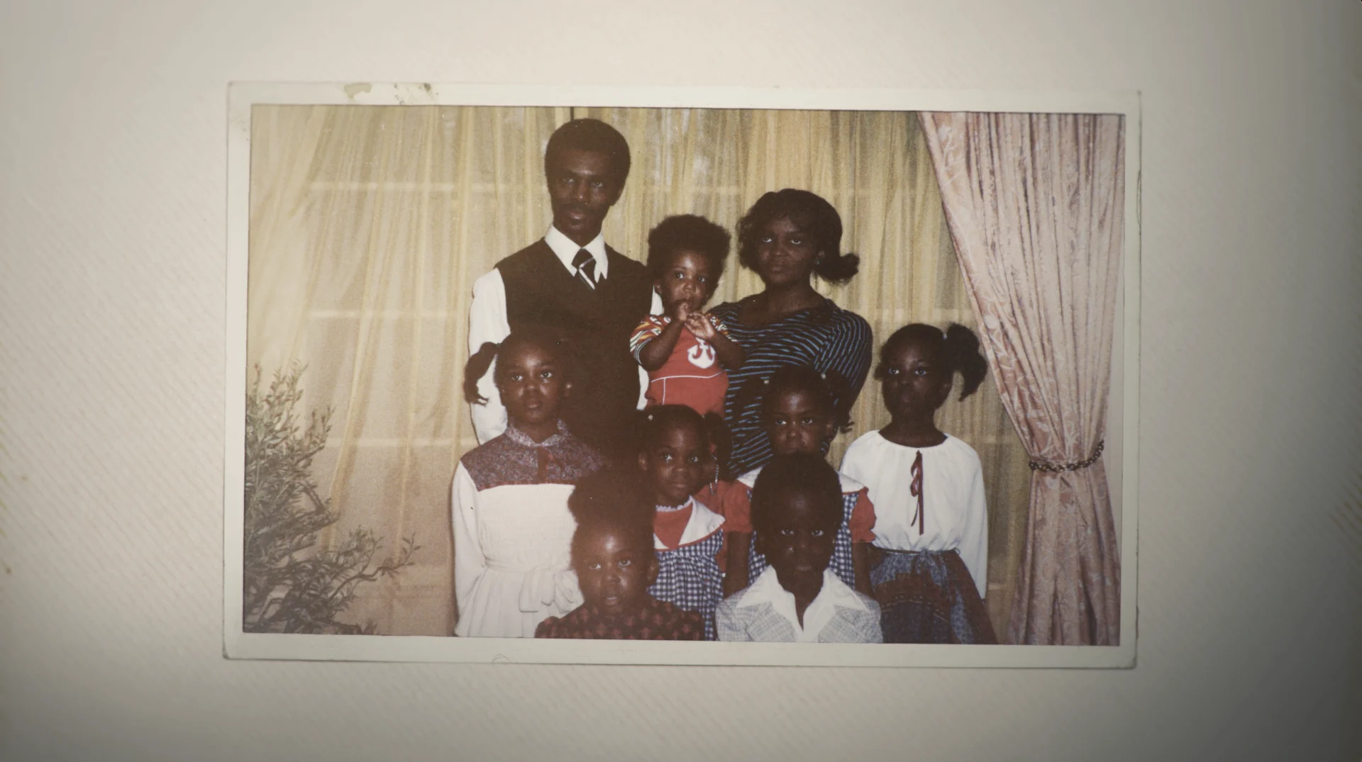

A favorite episode to work on for our team was the Hollywood episode, exploring how The Hollywood Sign is as much a marker of location as it is a marker of industry. First erected 100 years ago as “Hollywoodland,” the bold, mountain-bound letters are a bona fide fixture of Los Angeles’ landscape, and have impacted the way the city has expanded and the visual language of the films made in its shadow.
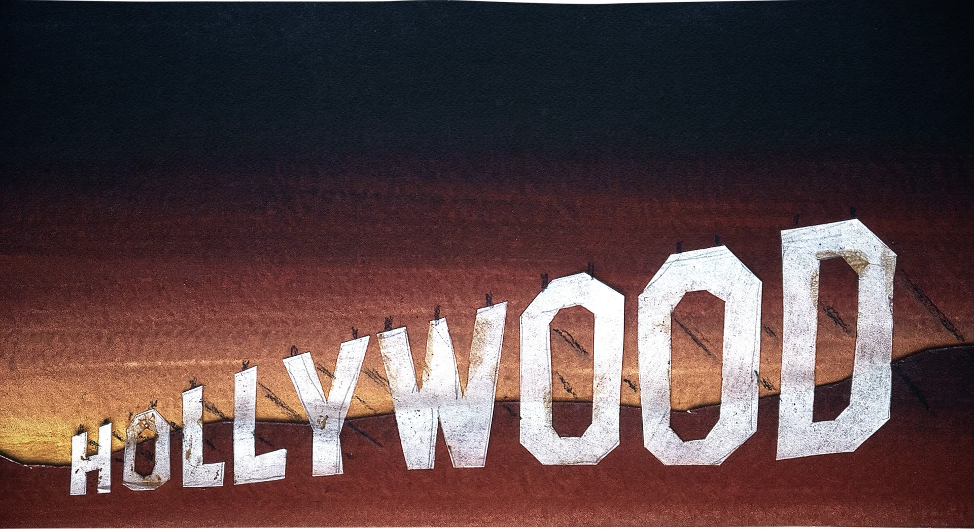
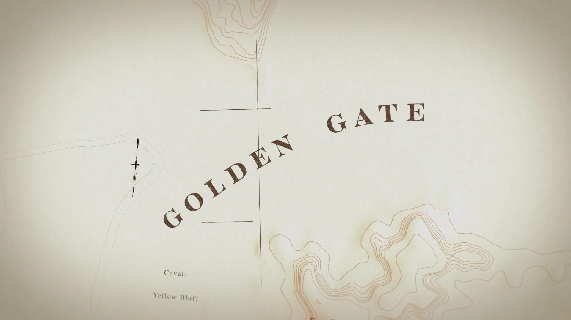
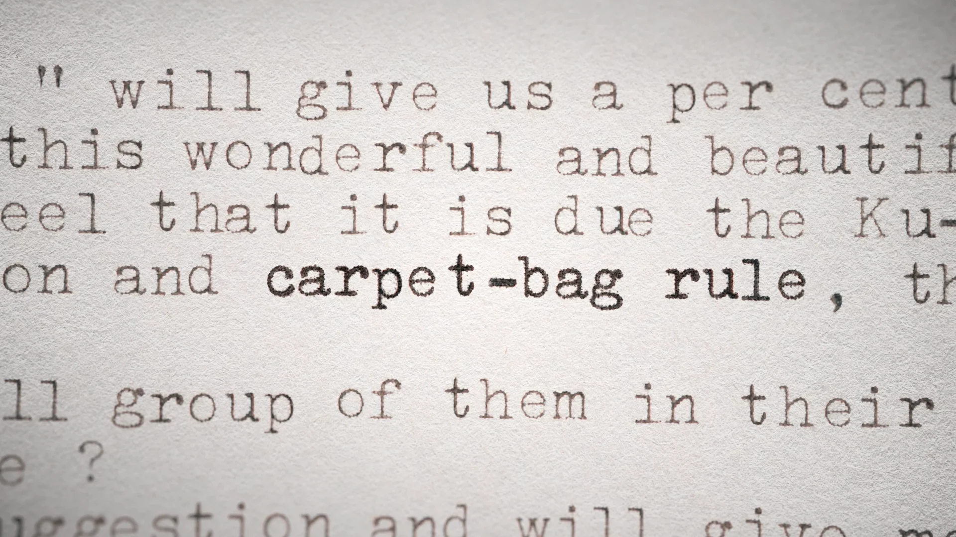
Designing a visual language that reflects the influence of this symbol and all the others featured throughout the series while also storytelling in a beautiful way kept us working on this project for about a year. In addition to Hollywood, the series also covers Fenway Park, the Gadsden Flag, the American Cowboy, the Statue of Liberty, the American Bald Eagle, Stone Mountain and the Golden Gate Bridge.
Once we had a few episodes under our belt and a better understanding of the icons we wanted to use, we were ready to tackle the title sequence. Nick Woythaler jumped in on that was able to design something big and all-encompassing that suited the show and the featured symbols.
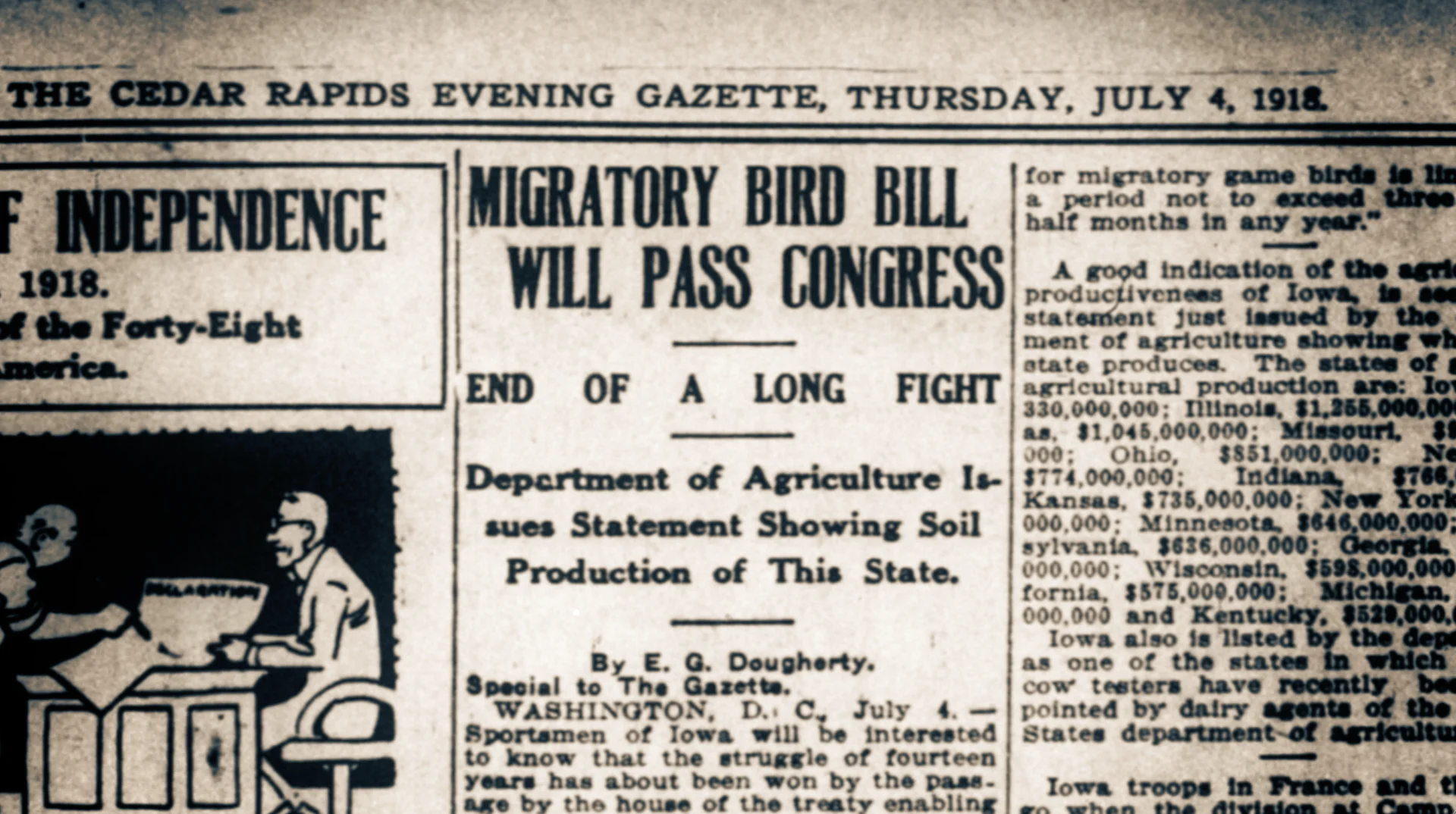
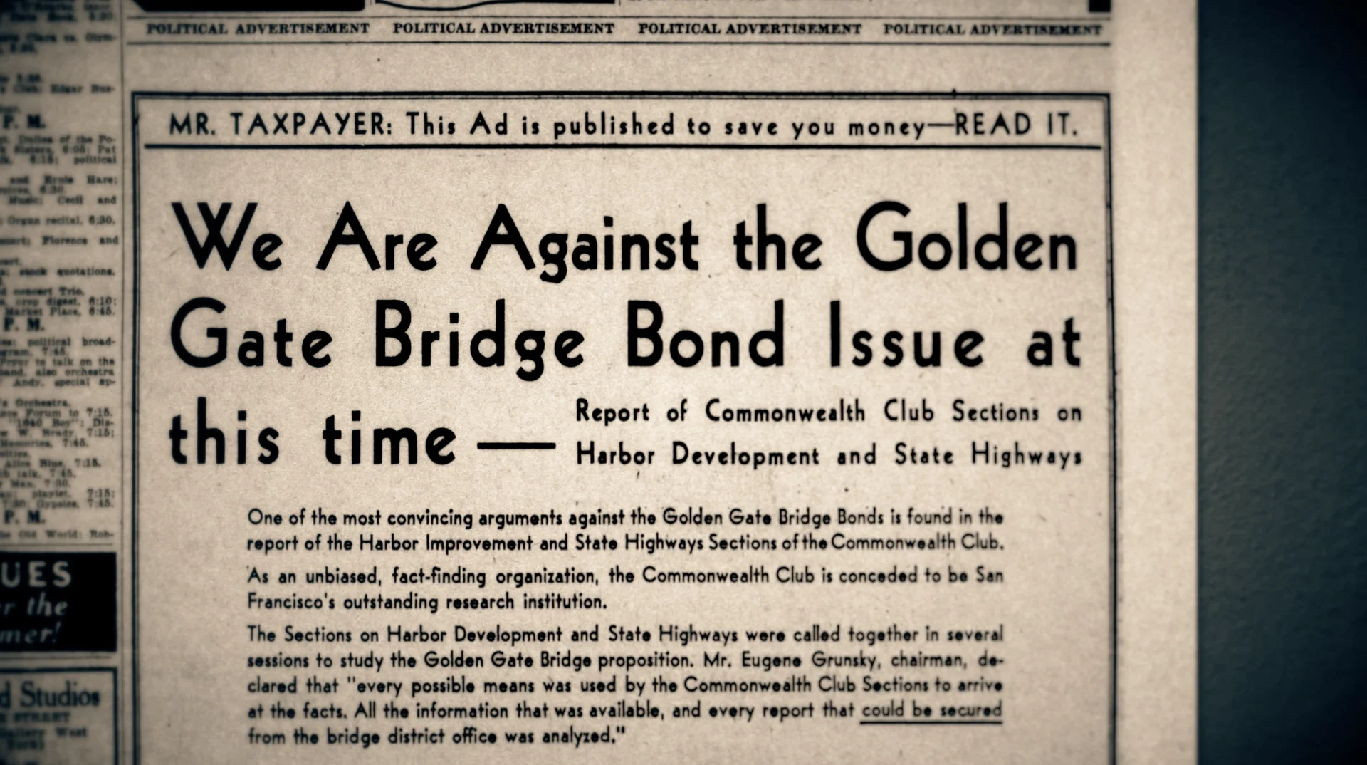

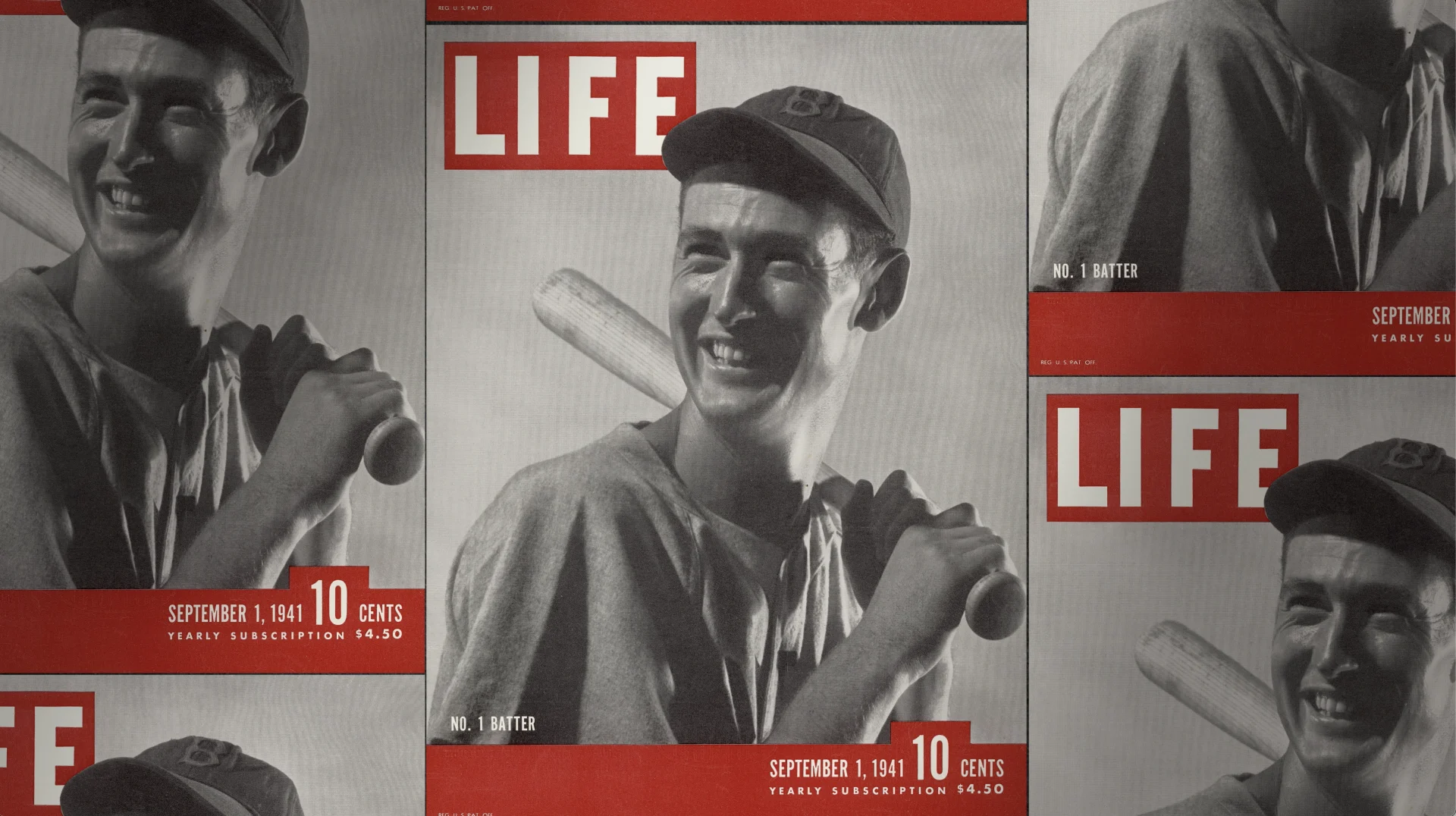
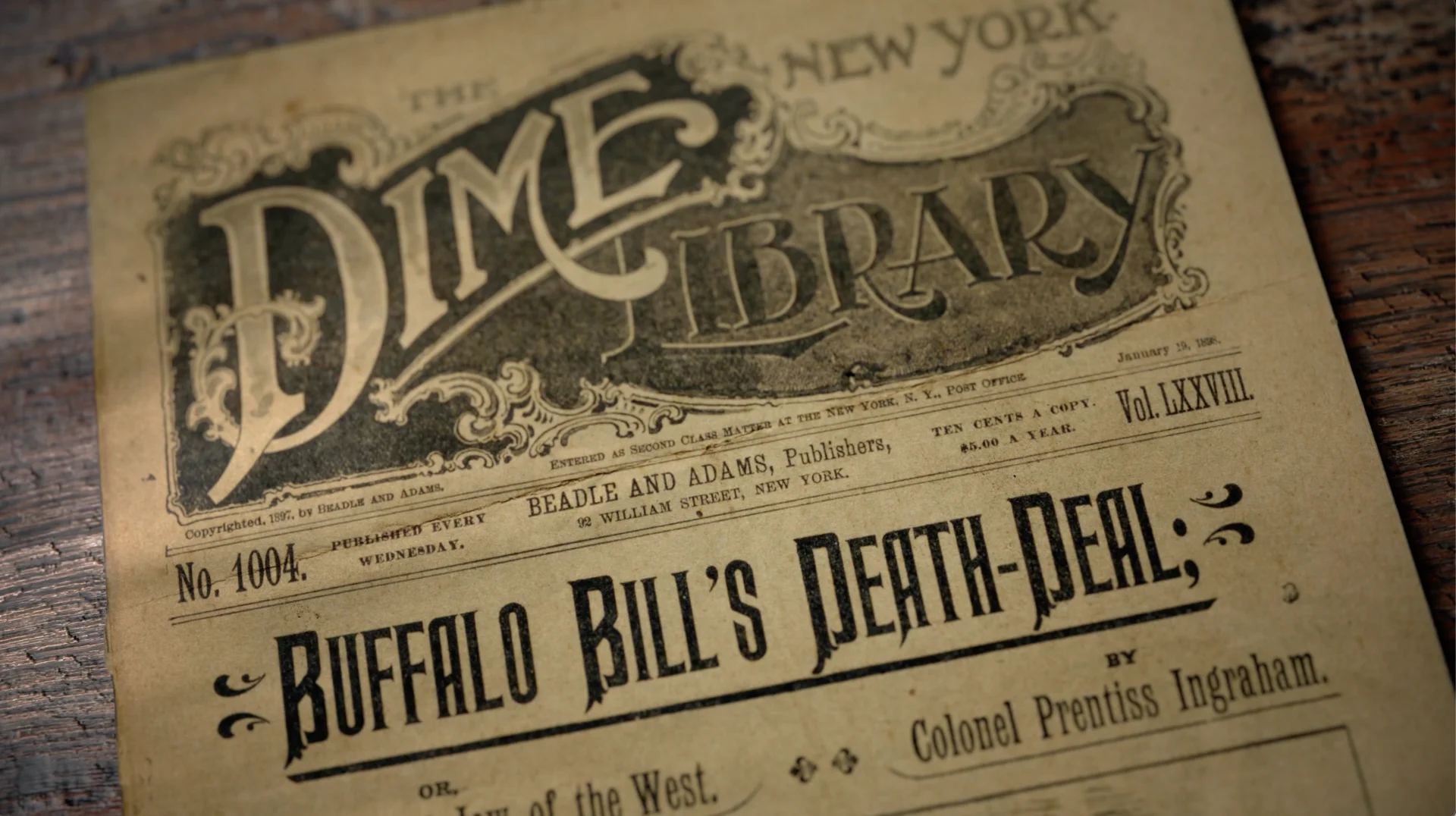
The series was spurred by Rubenstein’s insatiable curiosity and lifelong interest in American history, and we were thrilled to be able to design a design language that facilitated this storytelling and drive the series’ narrative and frame it through analysis, reflection, and counterpoint. Thank you to our partners at PBS and Show of Force for letting us be a part of this important series— these are the stories of the country’s history, and also the story of America today.
a global journey
Searching For Soul Food
“Searching for Soul Food” is a Hulu original series that follows rock star celebrity chef Alisa Reynolds as she discovers what soul food looks like around the world. We partnered with the series’ producers, Brightroad and All3media for Onyx Collective on Hulu, to produce GFX that graphically underscores the series’ narrative as Reynolds seeks out the food, explores the stories, the people, and the traditions of each place she visits.
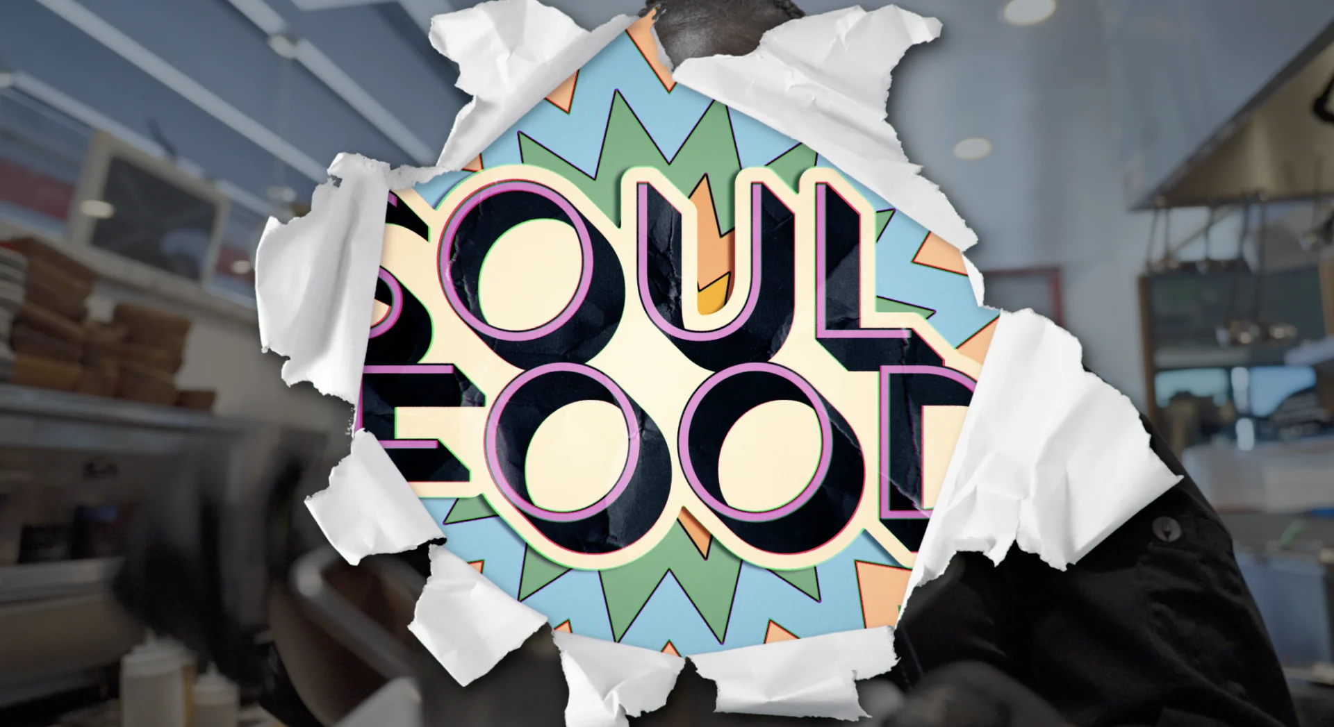
The international journey that is the premise of the show finds Chef Reynolds exploring the culinary worlds of Mississippi, Oklahoma, Appalachia, South Africa, Italy, Jamaica, Peru and Los Angeles. We were immediately invested in the idea of exploring the versions of soul food beyond the American South and clicked with the creators of the series who wanted a bold and edgy look to suit the chef’s personality.
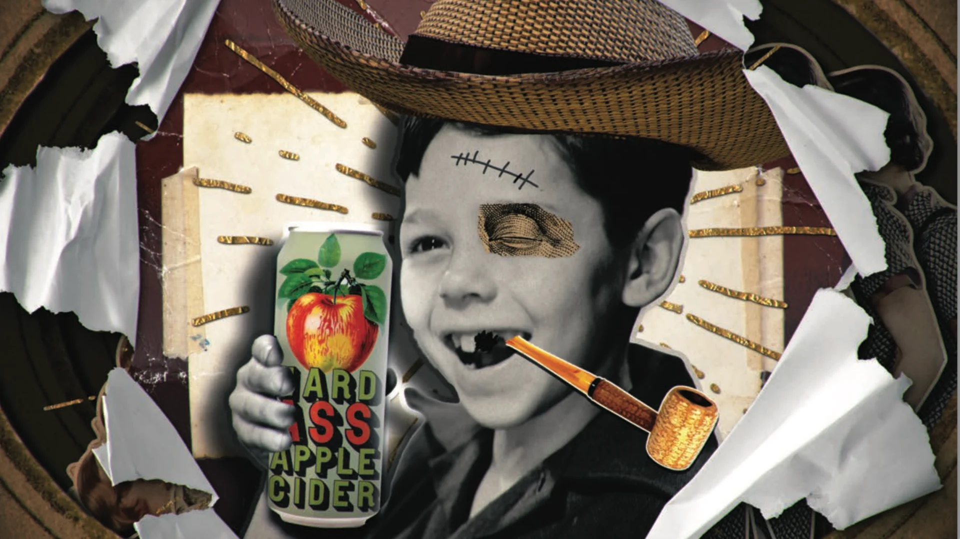
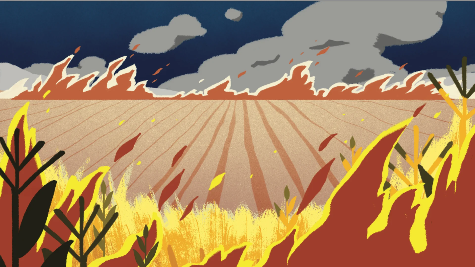
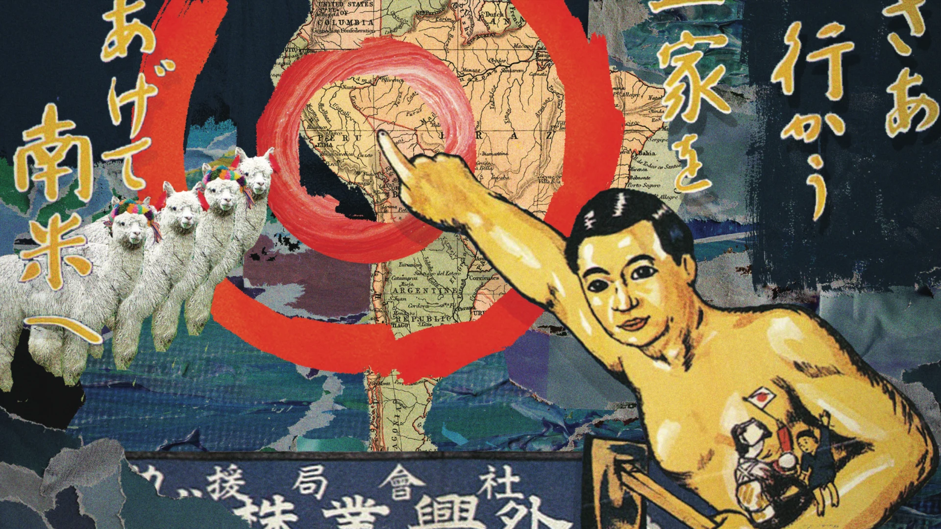
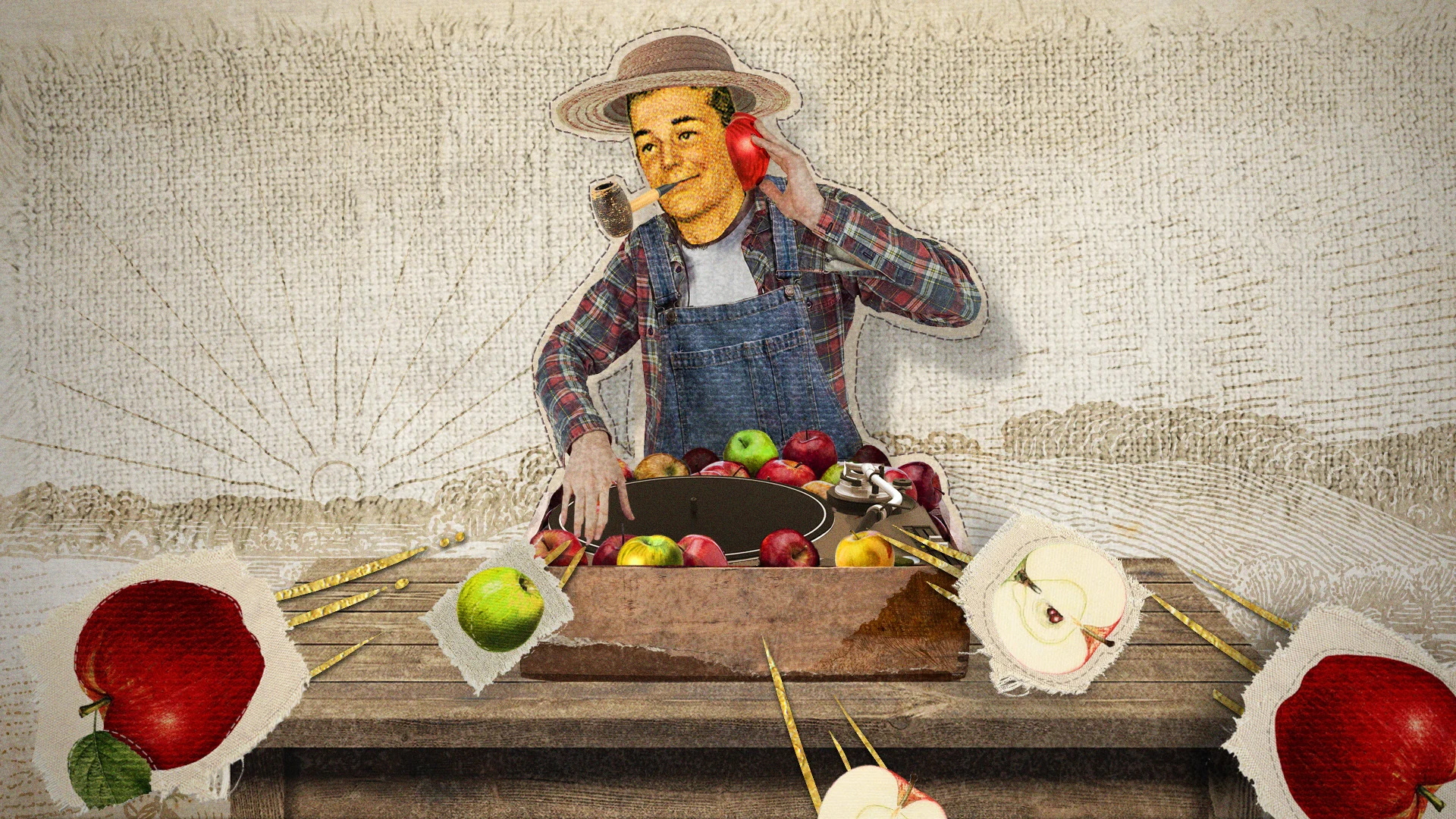
From the outset, we wanted Chef Reynolds’ personality to exude into the graphics and so we focused on finding a design in our exploration that was bold and energetic, but also kind of cheeky. We were given a ton of room to explore during the expansive discovery process and push the limits of our creativity. With each round of feedback, we had license to push the boundaries just a hair more.

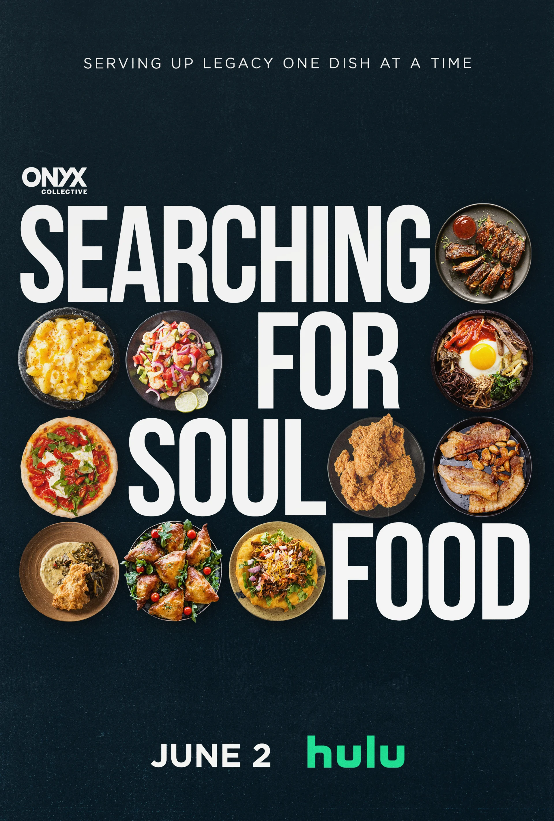
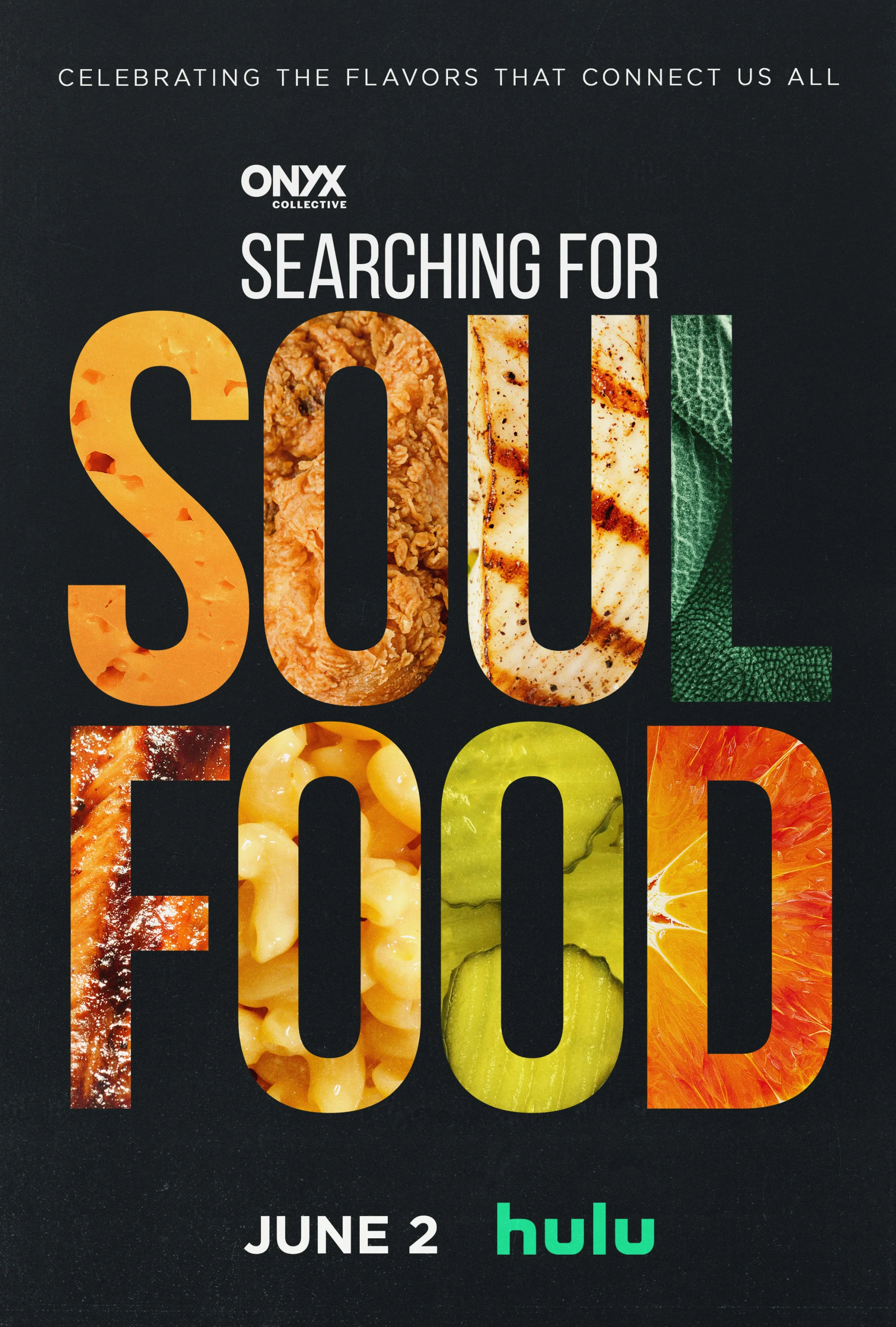


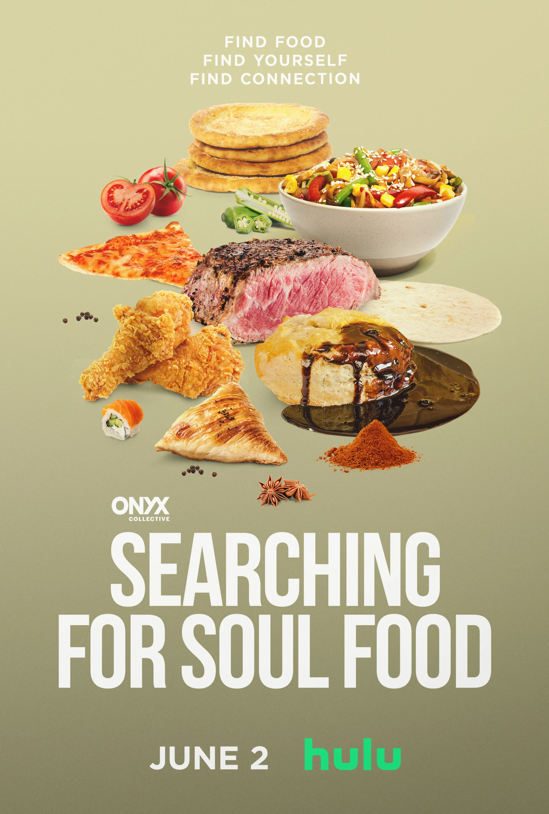

Once we landed on the vibe, we designed the historical and cultural explainer sequences that appear in each episode, aiming to find the balance of quirky and informative. We kept the design fun, but also ensured that the necessary thematic elements were being shared in order to keep the episodes cohesive. As these came together, each episode really developed its own identity and style. The design was so collaborative that a ton of BigStar artists contributed to at least one element that appeared in the final edit of an episode.
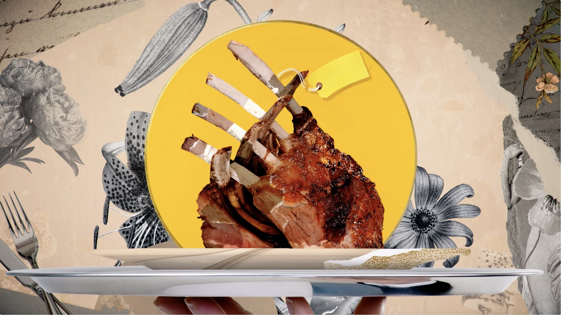
We couldn't have done this job without tapping into the incredible designers at Bigstar. When you are tasked with creating a pizza party in the style of DaVinci's The Last Supper, you can't exactly find that on Getty.
Searching For Soul Food (continued)
By the time we moved into animation, we really sped up our process and had found a narrative language that suited the series. Seeing the episodes in motion helped us know what elements needed fine tuning and where to tweak to get the design right. Overall, the look of the series leans into the cultural style of soul food and the personality of Chef Reynolds, and our design reflects that while still remaining uniquely BigStar.
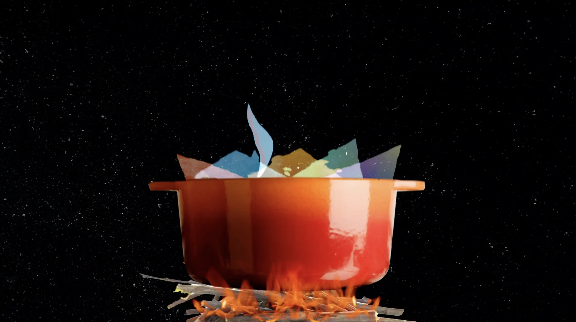
Collaboration is at the heart of soul food, and working with our creative partners at Onyx Collective on this amazing series really allowed us to embrace the community element of soul food. Watch all eight episodes available to stream on Hulu, now.

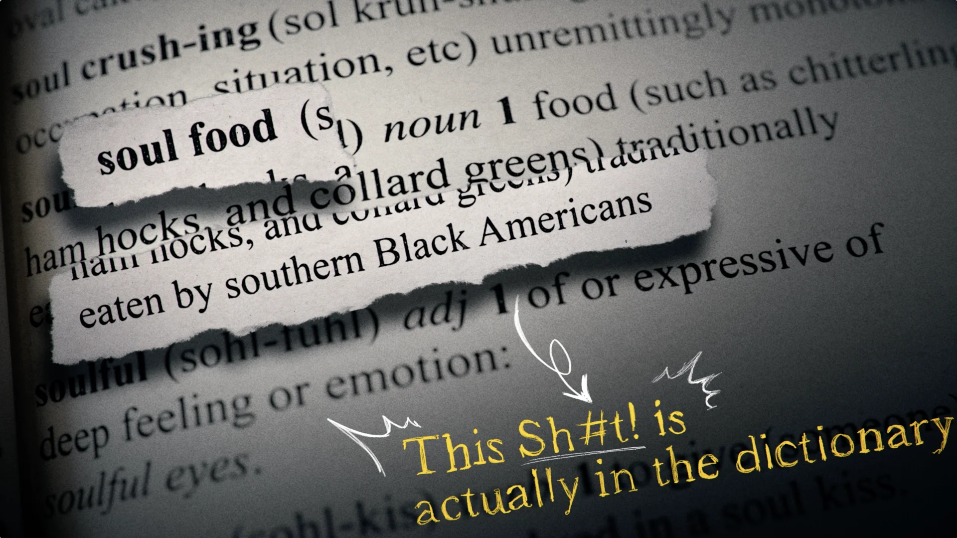
The great part about this project was that nothing was conventional. We gathered inspiration from so many areas and were given a great amount of freedom, once we reigned in the infinite… we were free to just have fun with all.
Props where props are due
Credits
Arnold
Executive Creative Director Josh NortonExecutive Vice President, Executive Producer Carson HoodSupervising Producer Kristen PritchettDesigners Ivan Viaranchyk, Ross HendersonLead Animator Carl DempseyAnimators Tifé Odumosu, Chris Scales, Ivan Viaranchyk
Iconic America
Creative Director, Designer Mark ThompsonExecutive Vice President, Executive Producer Carson HoodSupervising Producer Kristen PritchettDesign Mark Thompson, Ivan Viaranchyk, Paddy Driscoll, Chris CarboniAnimation Ivan Viaranchyk, Liu Chia-Lung, Carl Dempsey, Tifé Odumosu, Paddy Driscoll, Elijah BenMain Title Design & Animation Nick Woythaler
Searching for Soul Food
Creative Director, Designer Mark ThompsonExecutive Vice President, Executive Producer Carson HoodSupervising Producer Kristen PritchettDesign Sohyun Park, Paolo Garcia, Sung DoAnimation Addy Afzali, Sung Do, Carl Dempsey Liu Chia-Lung