Volume 43 / November 18th, 2021
Volume 43
Client
Various
Take a closer look at our work on HBO's Game of Thrones forthcoming prequel, House of the Dragon, Shudder's Behind the Monsters and MSG's sports betting show packages.

Gods. Kings. Fire. Blood.
House of the Dragon
Teaser and Promo Graphics
House of the Dragon is the highly anticipated prequel to the blockbuster series Game of Thrones, and we teamed back up with our partners at HBO to bring it to life. After six seasons working on Game of Thrones, it was an honor to be back in the ring for House of the Dragon to build on the legacy of the original series.
Once HBO made the decision that House of the Dragon would be the next extension of the GOT universe, we dove headfirst into the launch campaign. First things first was determining how to bring the news of the prequel’s 2022 air date to the public.
The announcement had to be :15 seconds, beautifully designed, and ramp up excitement around the show’s focus-the House Targaryen-without using any footage from the show. Dragon iconography is a key element of the Targaryen family and the concept of unveiling the House sigil in a burst of flames was the perfect way to introduce the next chapter of the GOT franchise.
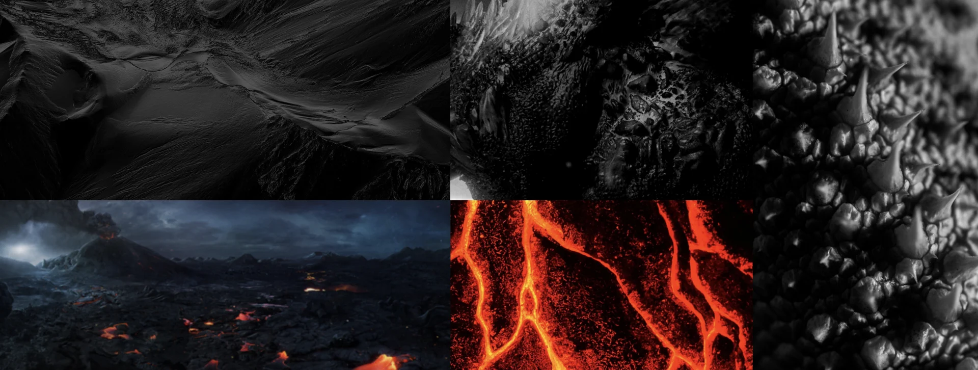


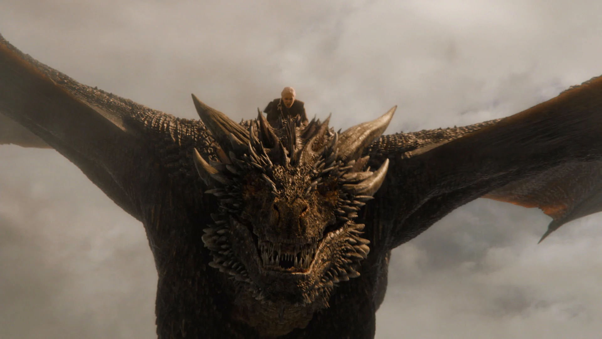


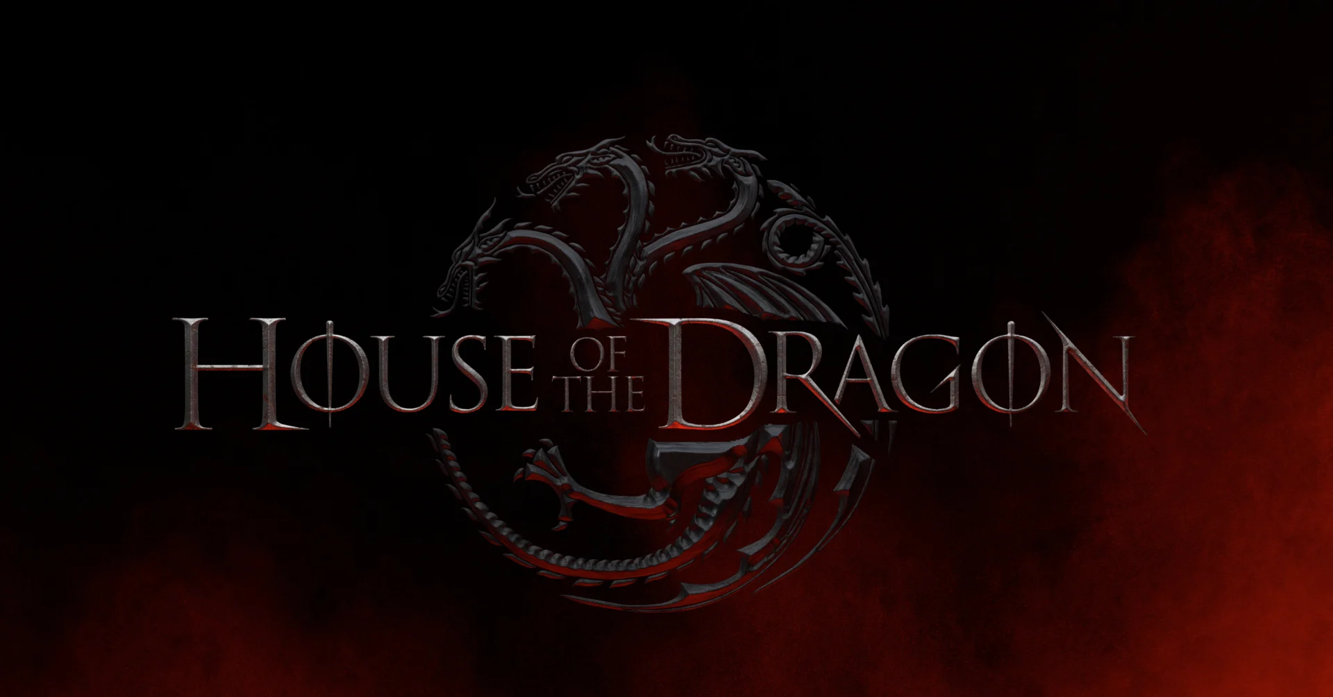


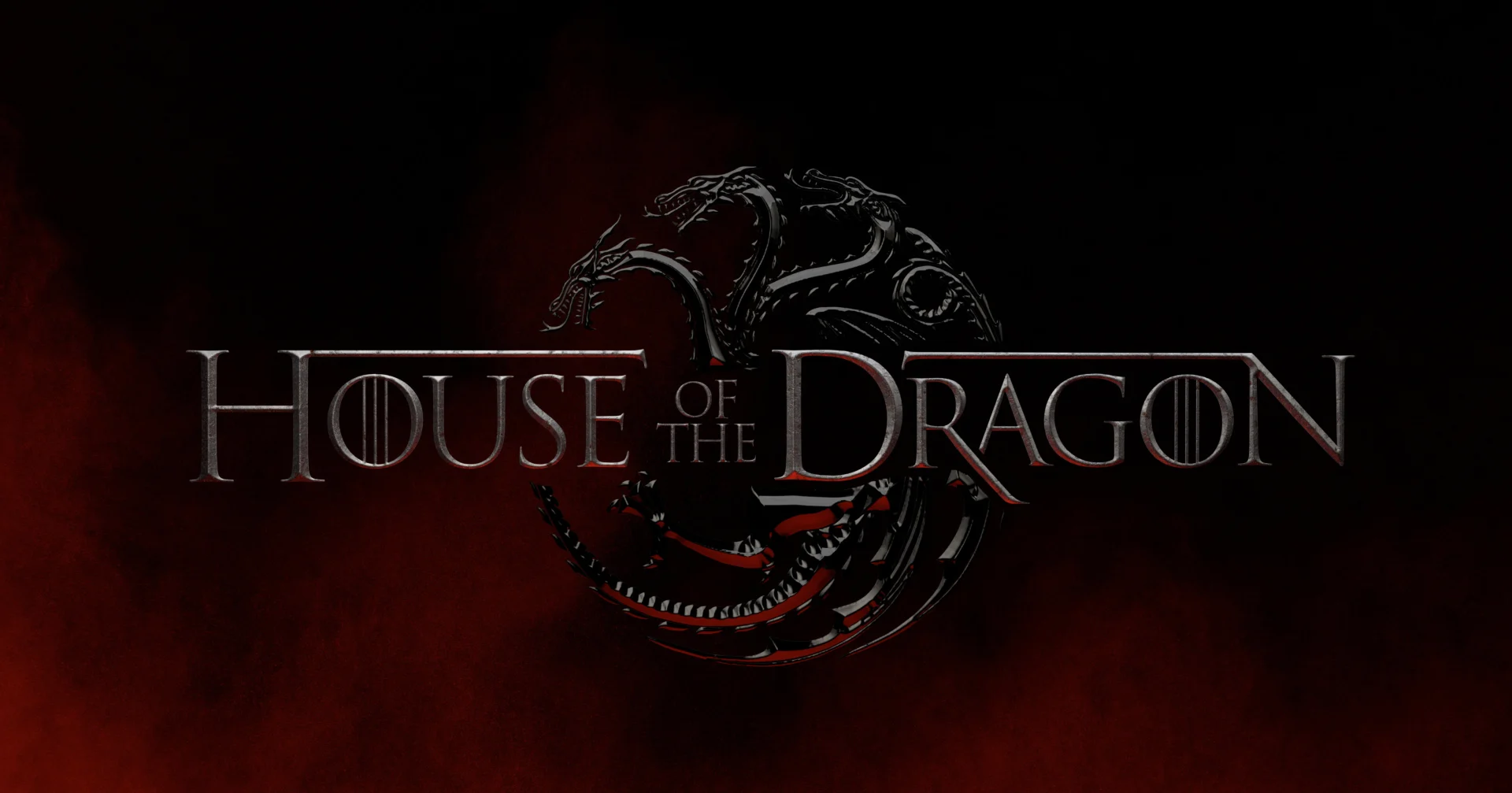
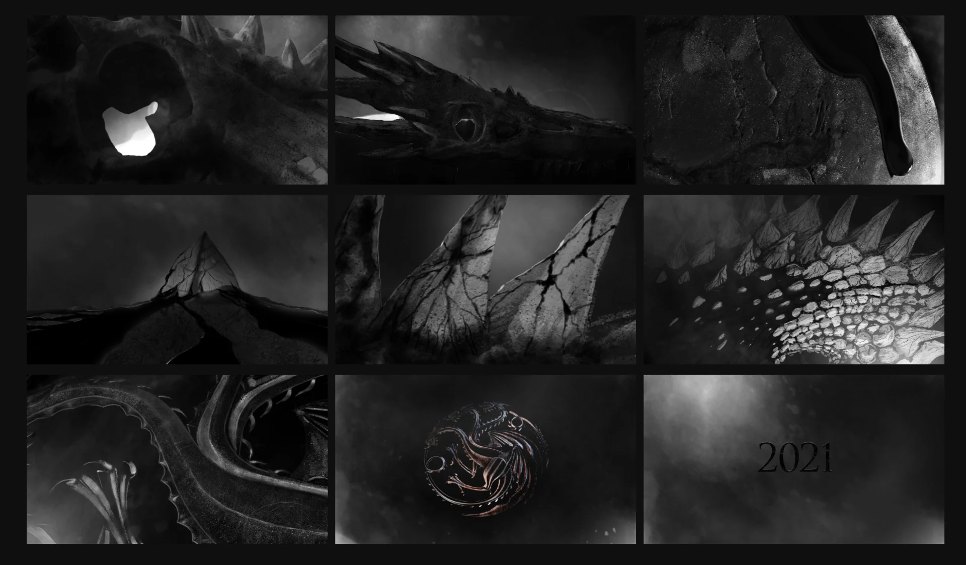
We needed to elevate the Targeryan sigil to give it a renewed focus for House of the Dragon, but wanted to stay true to the original 2D Targaryen sigil. We also wanted to bring in some of the iconic style of the Game of Thrones dragons. Researching and drawing inspiration from the historic GoT dragons, the design team utilized several different metals and firelight images to execute the rendering.
We began by modeling the Targaryen sigil- tweaking the style slightly in regards to the legs, teeth and a few other elements to subtly elevate the design.
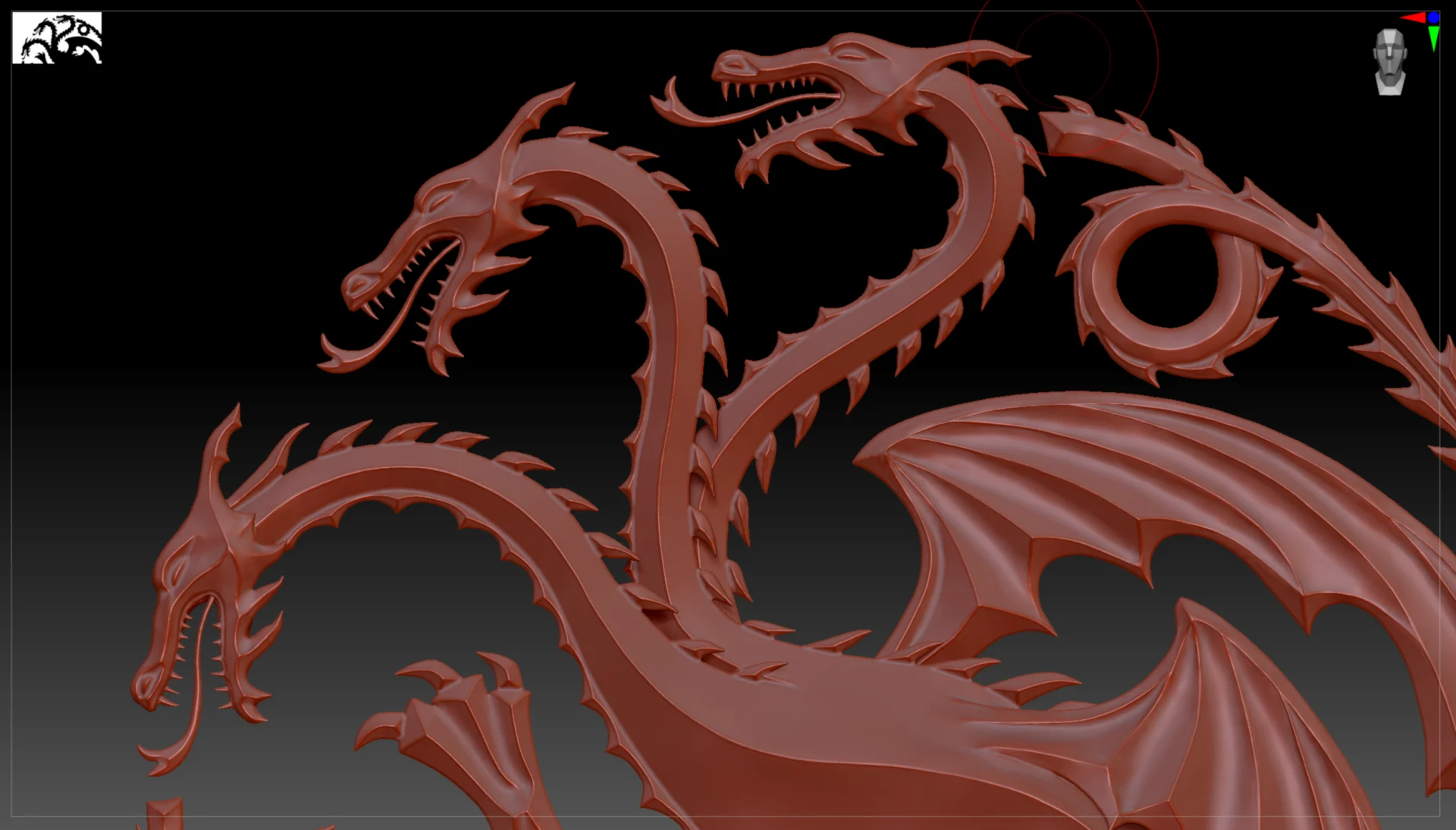
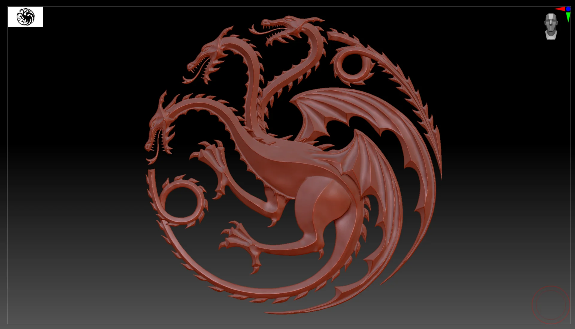
Lead designer Conner O’Brien led the process, managing the end-to-end 3D work. “To create the sigil model I used Zbrush so we would have no limitations in getting the exact look and feel we were going for,” O’Brien said. “For the rendering I used Octane in C4D. Octane just had that level of realism we really wanted.”
From there we ignited the golden sigil using dragon fire created in Houdini.
The :15 second spot was unveiled by HBO on several platforms simultaneously to a hugely positive response from the Game of Thrones fandom. This was particularly exciting for us and the team at HBO because there is far more pressure to launch a series tied to a cultural icon than your standard promotion. Once the reviews were in, we focused in on the deliverables still to come and kicked our internal standards up even higher to align with the public’s newly formed expectations.
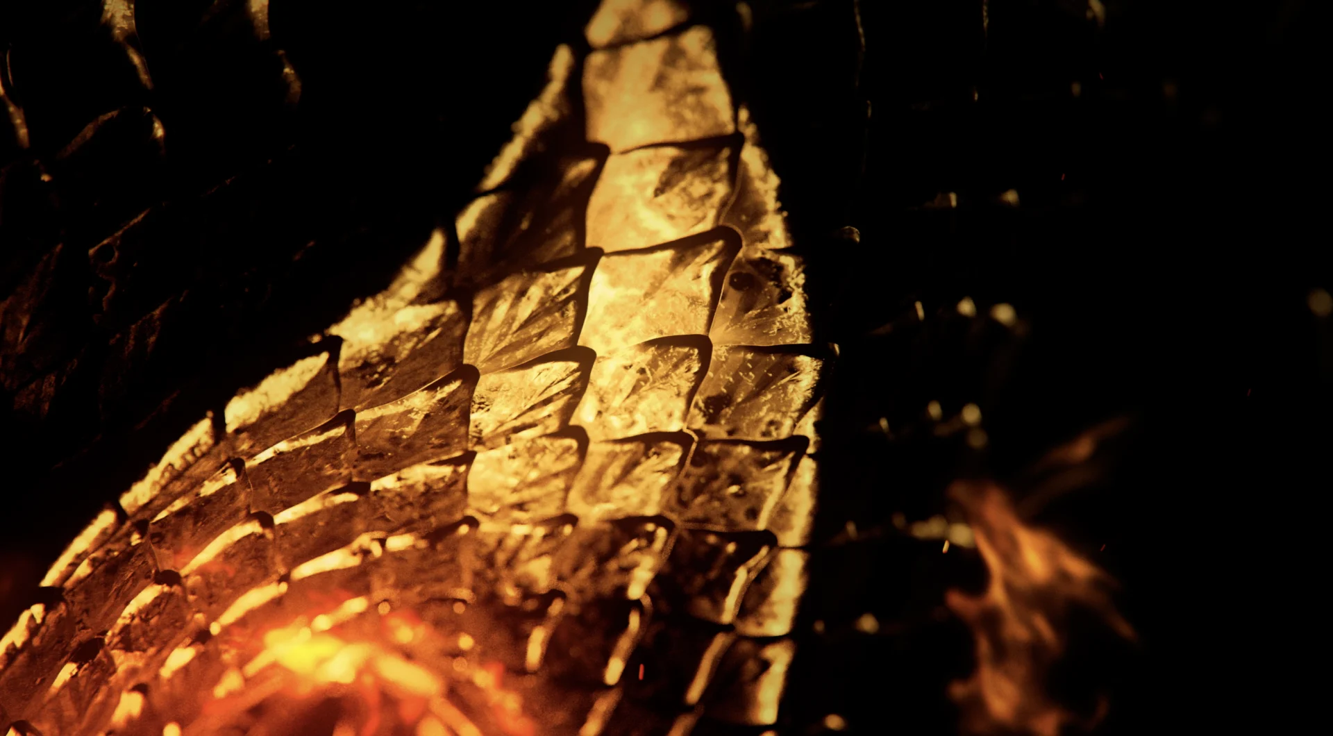
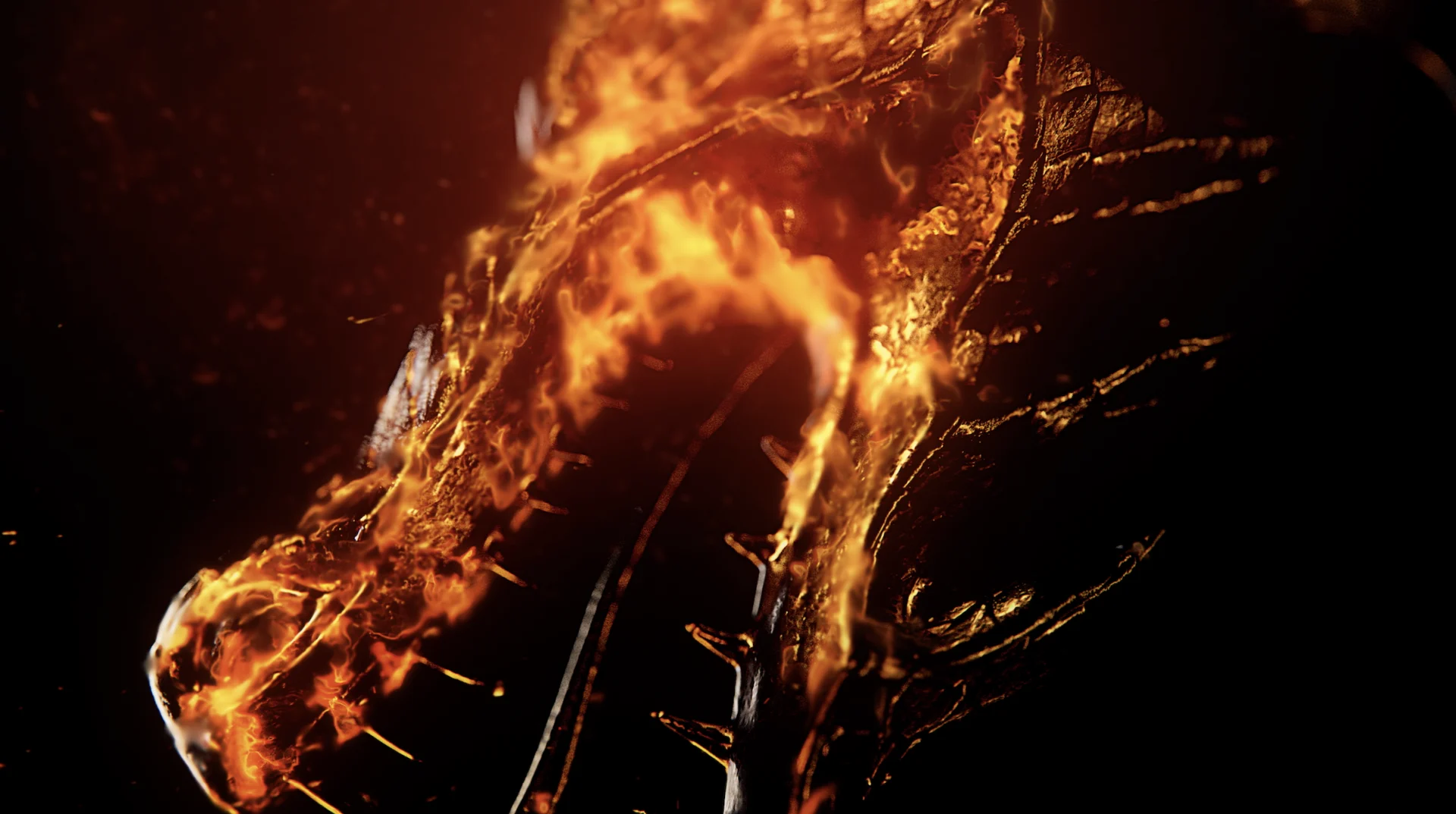


We took the elements from the sigil tease and built out a toolkit for the team at HBO. Fire elements, title cards, interstitials, the sigil itself and more were included in that package enabling HBO to apply those effects wherever they were needed.
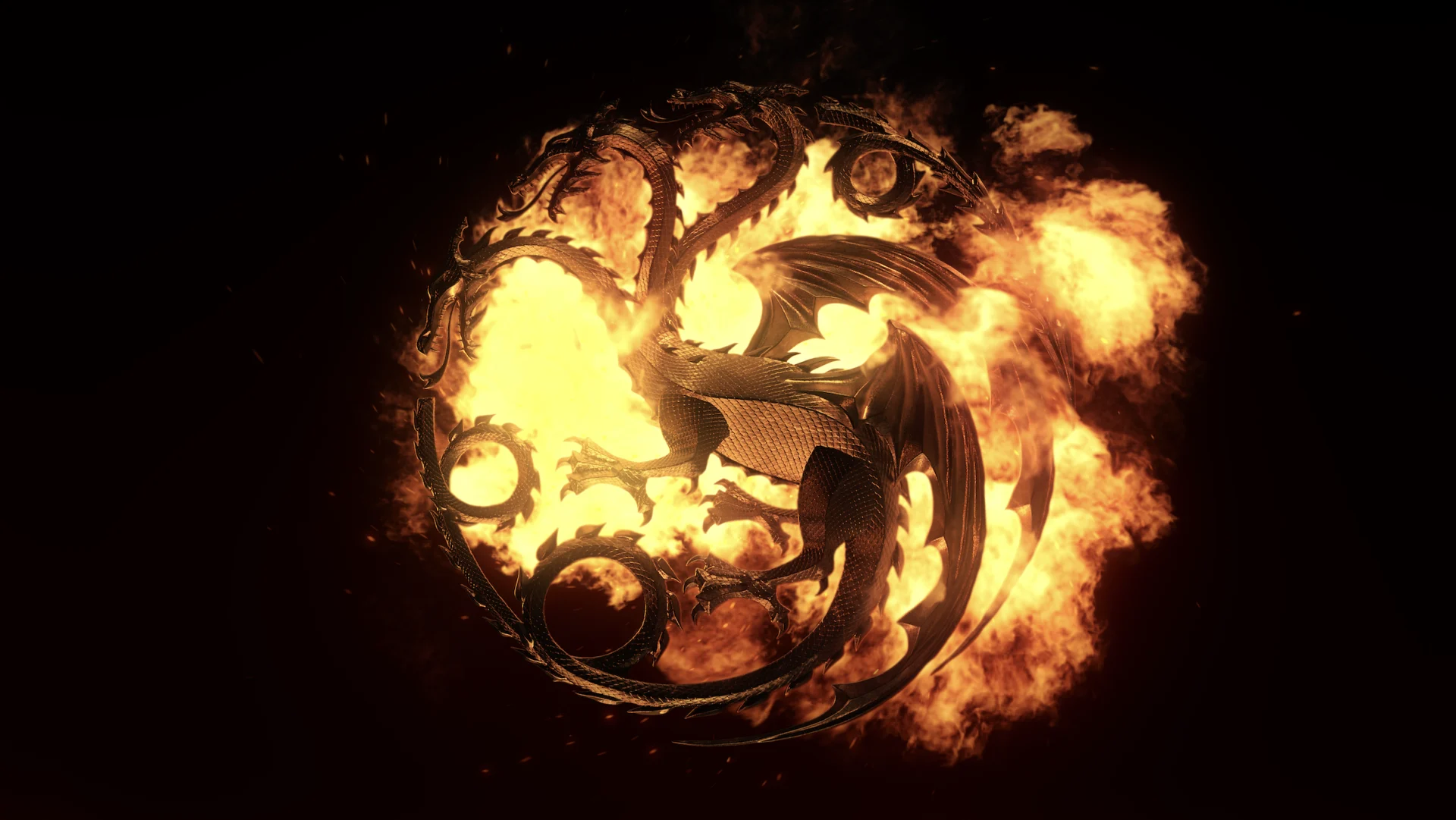
HBO utilized this toolkit in combination with footage from the show to create the official House of the Dragon teaser, giving fans an even more in depth peek at the series to come. Original BGSTR design can be seen throughout the trailer, and the back :15 seconds are entirely BGSTR created- the logo, the date, the HBO button - all were rendered, textured and animated by our team, including the fire in Houdini.

child's play
Behind the Monsters
Show Open and Social Media Toolkit
Behind The Monsters is a documentary series dedicated to legendary horror characters and examining how these horror giants have managed to transcend the films that birthed them and infiltrate widespread pop culture. We were delighted to team up with Shudder, the horror-focused streaming arm of our longtime partner AMC, to design a show open that would ramp up excitement for each episode and give a proper homage to each iconic horror character featured.
To kick off the project, we brought in a reference deck that covered a pretty wide range of thinking. We presented several different aesthetic approaches that were interesting to us -- cinematic vignettes, moody 3D, and iconic poster inspiration. The Shudder team gravitated toward the graphic approach which was great for us because it enabled us the most creative flexibility and the ability to turn the project around on a tight deadline.
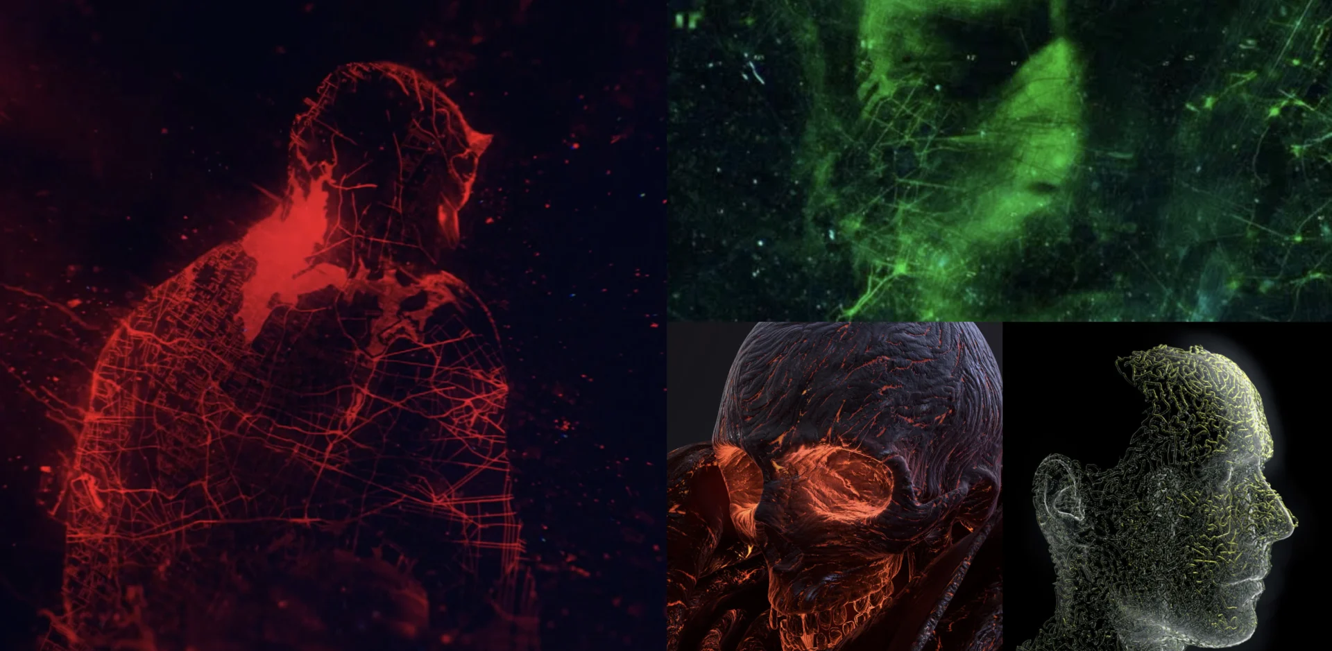


The biggest challenge we faced on this project was one that was apparent from the start-- we didn’t have licensing rights for the six iconic horror characters the open was set to feature. Luckily, our team enjoys this kind of challenge and found this is where our print inspiration came in massively helpful.
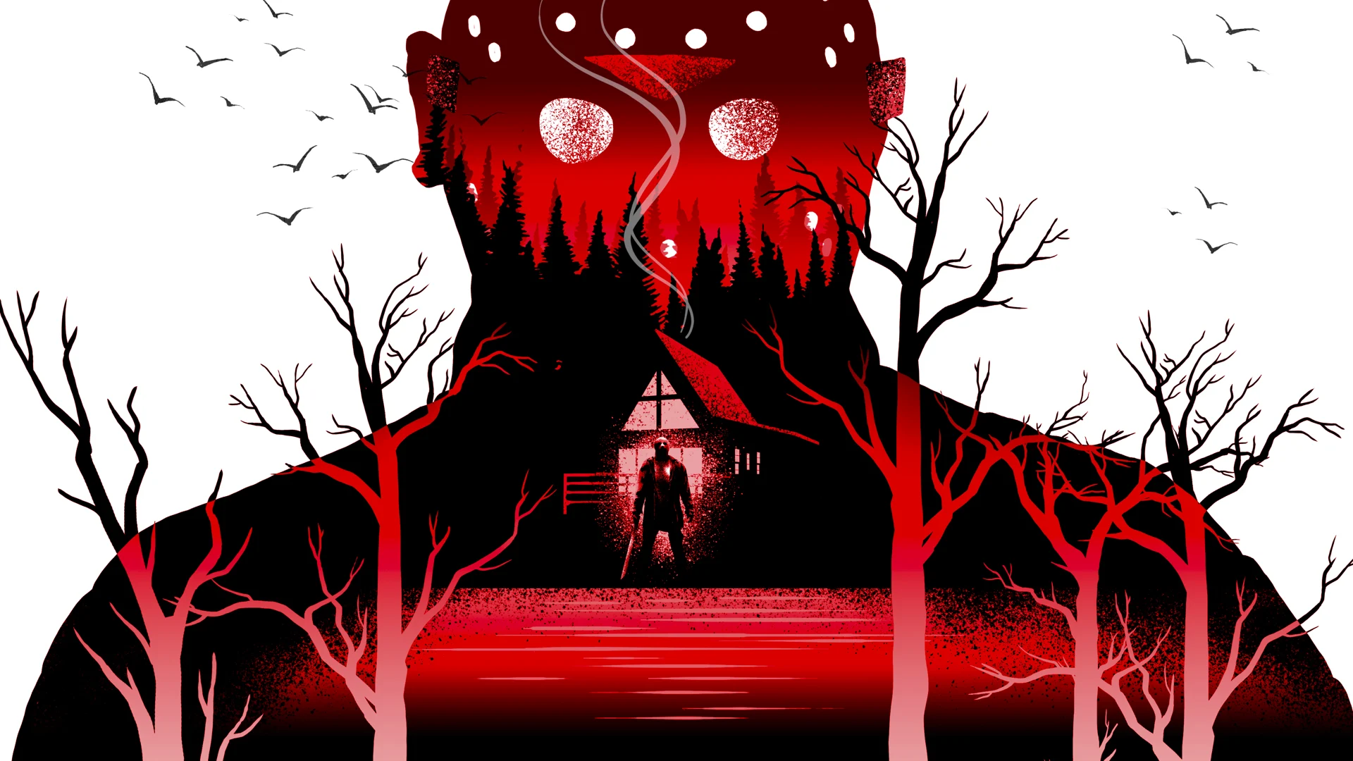


Creative Director John Leamy said, “For each monster, I tried to create a silhouette that would be instantly recognizable to the viewer and distilled the vibe of each figure down to a shape augmented by a few small details that served to remove any doubt without truly showing anything that would cross the line liability-wise. Because they are such iconic characters, it wasn’t hard. Super fun.”
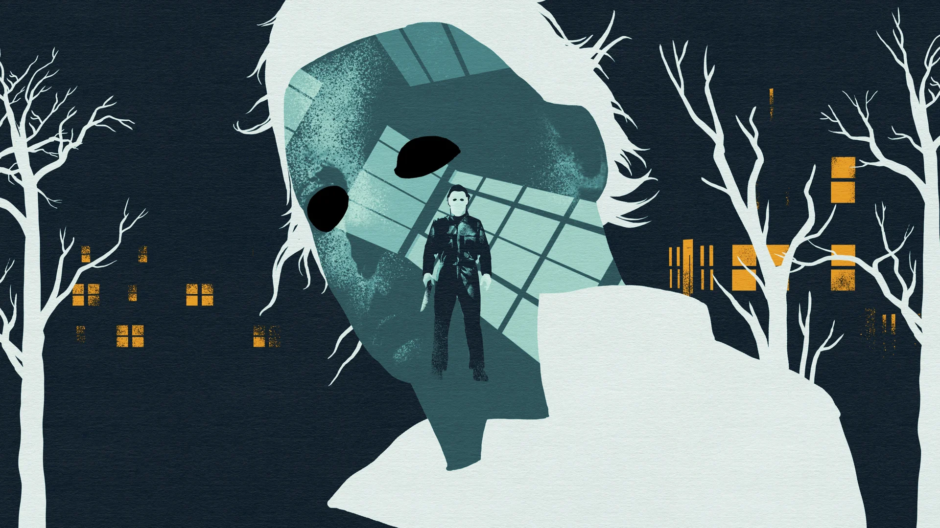

Once the characters had been illustrated, the next step was to create a smaller internal world or scene within each silhouette to contain a full body version to serve as the starting point during a camera pullout, finishing to reveal the full silhouette. If the initial reference isn’t clear, we hope it becomes clear two seconds later!
From there, we animated and edited the spot into a tight :15 seconds, flowing from Michael Myers, to Freddy Kreuger, to Chucky and ending on the show’s logo. Distilling the pop culture icons into a visual shorthand was a cool way to revisit the legacy of these films we grew up watching and hopefully to help make them more iconic.
When it came time to add in a soundtrack, Leamy brought in a key perspective as both a fan of the horror genre and musician. Leamy described the process, “Because each character was allowed two seconds of screen time to make the edit work, I needed music that would work with those beats perfectly. Retro-fitting a piece of stock music seemed more trouble than writing something custom-built would be."

"The tone of the program isn’t dark or particularly horror-bound, despite the subject matter, so I wanted the music to allude to the genre while still embodying a more contemporary and almost club vibe. This was a big consideration in creating the illustrations as well. Not scary, please.
To link back the genre, I thought about the famous scores and devices used initially in the films. The chord movement is based on Mozart’s “Dies Irae”(used in The Shining), and there is a top line of piano meant to be reminiscent of John Carpenter’s approach to the Halloween score. Dramatic and discordant horn stabs punctuate each character change, and camera reflex and flash sfx help give a small sense of paparazzi and celebrity.”


We presented Leamy’s original soundtrack along with a few other options and thrillingly, the Shudder team was as impressed with Leamy’s artistry as us! The original piece it was. The finished spot went over so well with the Shudder team that we revisited the project in order to add a social package based off the work we completed around the open. We delivered a package for Shudder’s social team designed to be evergreen so that it could be repurposed by the network depending on need.


It was a blast working with the Shudder team to reimagine the horror figures that defined many of our childhood and getting to put our own spin on things.

I was glad the AMC/Shudder team gravitated toward the graphic approach because it allowed me to better illustrate what is unique about each character while uniting them under a shared technique and color grade.
got edge?
MSGN / The Betting Exchange
Show Packages
MSG Networks is in the process of expanding their lineup of sports betting programming, and we’ve been lucky enough to partner with them on three different show packages. The Betting Exchange, Odds With Ends, and the Bettor Half Hour are a part of the network’s continued foray into sports betting, and the shows aim to engage fans in a fun and informative way.
This gave us a clear mission- differentiate the shows within their unique package and give them the right tone to match the hosts’ big personalities and the upbeat subject matter.
We initially presented a couple of design directions to the team at MSG to get a read on where our creative energy should flow. The team connected with two directions right off the bat, and those selections really formed the basis for the overall design direction. This was key, because once we were off to the races, we focused in on delivering our first show package with an extremely quick turnaround.


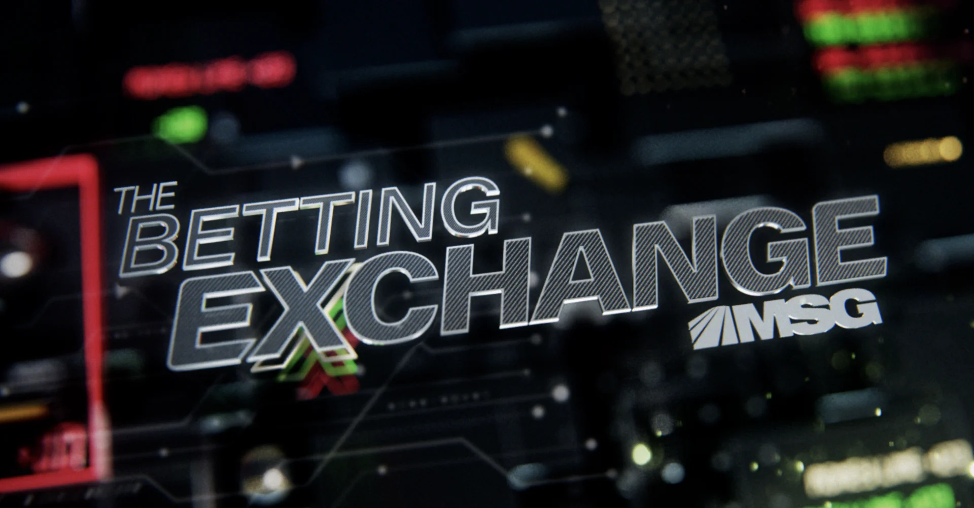
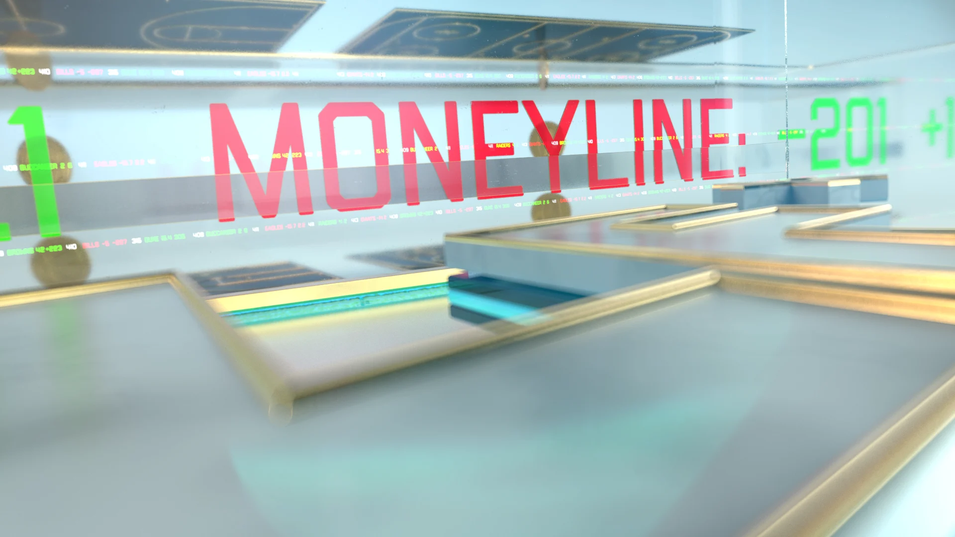
The first show in the trio we worked on was The Betting Exchange, a dynamic roundtable style show that dives into the latest betting trends across the sports world. Because it was the first to debut, we put a more traditional spin on it in terms of visually referencing classic betting tropes. We designed a visual language using a lot of red and green for losses and gains and financial tickers. Additionally, we created icons for the sports that will be covered on the show- football, boxing, baseball, football- even tennis.

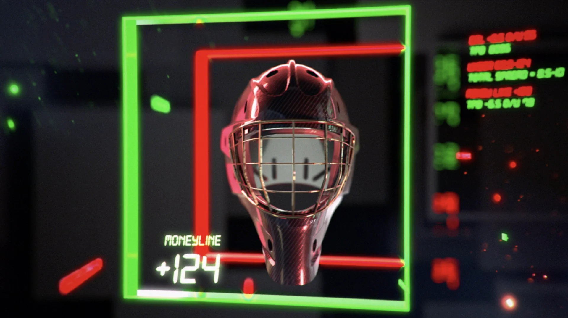

Combining these elements together and adding in some animation gave us a smooth :10 second show open with graphics built entirely in 3D. From there, we were able to deliver the rest of the show package- segment loops, transitions, show bumpers and the insert package.
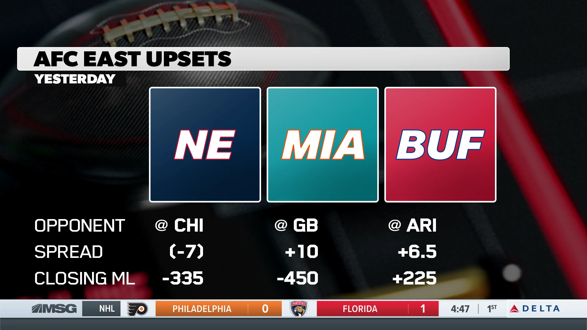


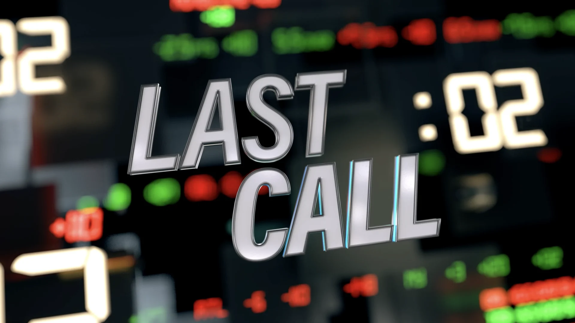

against the spread
MSGN / Bettor Half Hour
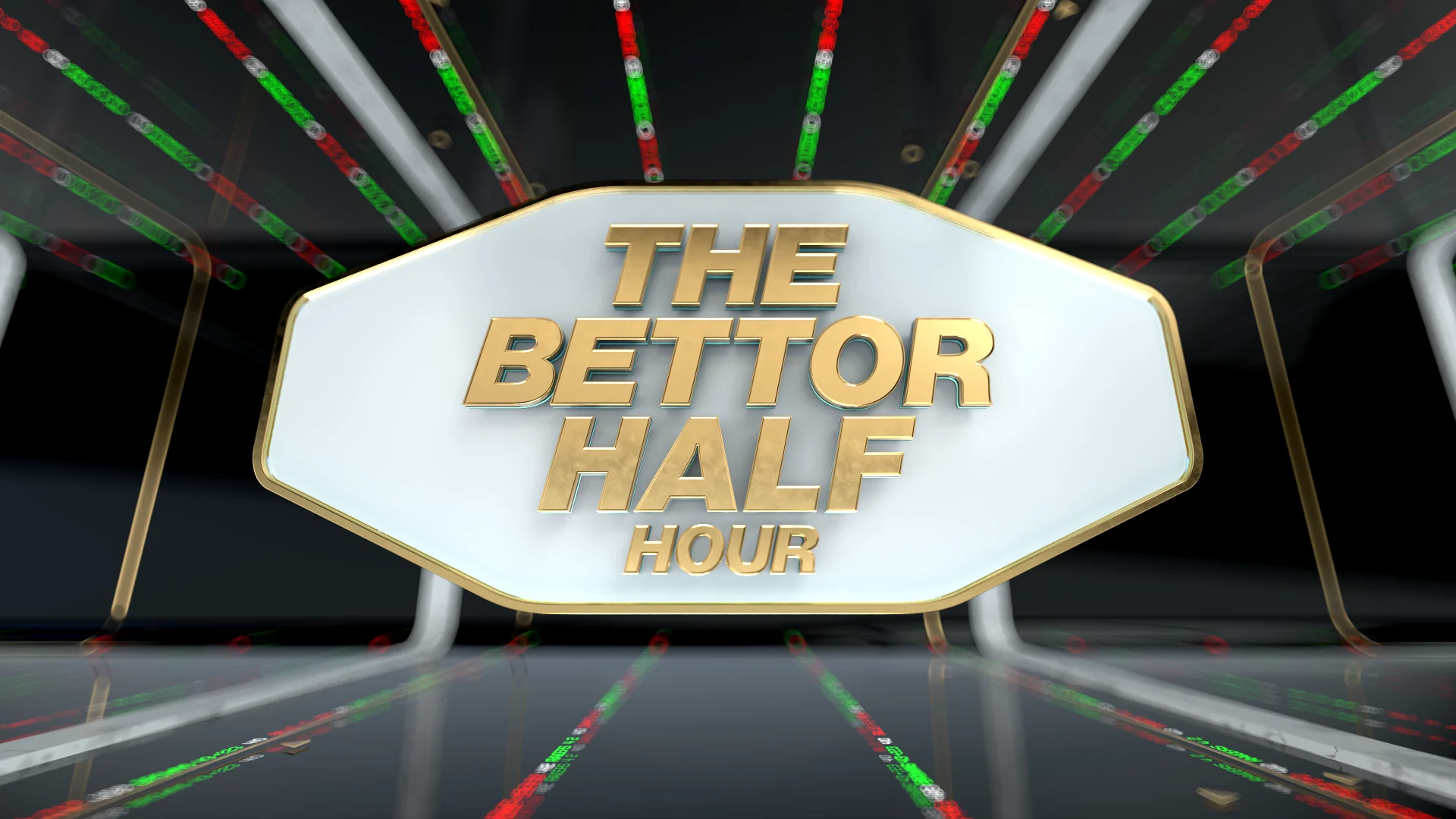
Once we’d turned over the reins to The Betting Exchange, it was on to The Bettor Half Hour, a show that we’d already largely developed the look for in our design presentations. The Bettor Half Hour gives an inside look at the sports betting landscape and has an educational slant, so we wanted the design to channel that visually.
We took this new set of design elements and applied it to the same set of deliverables we’d designed for TBE. Using 3D for this package adds a polished finish to the design and gives it a premium look and feel.

wage a bet
MSGN / Odds with Ends
For Odds with Ends, the final show for our betting collaboration with MSG, we pitched three new looks. To differentiate from the first two show packages, we landed on a 2D panel approach. This deliberate choice to go 2D had us bring in a different team of designers and set a different tone for the edits.


The one hour program will serve as the premiere sports betting show on game days, providing fans with in-depth player analysis, game breakdowns and top picks and betting predictions in the lead-up to kickoff. Hosted by former Giants Mathias Kiwanuka and David Tyree, we leaned into football specific imagery for our visual language, tying into our hosts' area of expertiseThis helped us set the visual language we wanted to push with our design and the result is a clean edit that achieves a premium look and feel using entirely 2D.

Working on the launch of these new shows has been an exciting effort for us here at BGSTR, and we were thrilled to get to swing by the newly built set to see our work in action. Their expansive content push is propelling the network’s continued foray into sports betting as it aims to engage fans in a fun and informative way, and the energy on set is palpable.
MSG is staking its claim on the growing sports betting market by creating an entire new genre of programming, and we are honored to be a part.
Props where props are due
Credits
It's always exciting to embark on collaborative proceses, especially when the creatives and producers are talented, energetic and all-around joys to work with. Shout out to everyone on the BGSTR front who worked incredibly hard on these projects.
House of the Dragon
Executive Vice President, Executive Producer Carson HoodHead of Production Virgil ConklinExecutive Creative Director Josh NortonLead 3D Designer & Animator Conner O'Brien3D Animation Brian Landisman, Nick WoythalerCompositing Casey DroginAdditional Modeling + Texturing Ivan ViaranchykStoryboard Artist Kurt HugginsVFX & Fire Sim Alec Iselin
Behind the Monsters
Executive Vice President, Executive Producer Carson HoodProducer Kristen PritchettCreative Director John LeamyHead of Production Virgil ConklinDesign, Animation, Music John Leamy
MSGN Sports Betting
Executive Vice President, Executive Producer Carson HoodHead of Production Virgil ConklinExecutive Creative Director Josh NortonProducer Rimma DreybandSr. Art Director Mark ThompsonArt Director Carol CaiDesigner Doug Chang3D Design & Animation Conner O'Brien3D Animation Brian Landisman, Nick Woythaler2D Animation + Compositing Paolo Garcia, Chris Scales