Volume 39 / May 25, 2021
Volume 39
Client
BBCAmerica, Turner Sports, Netflix
In this edition of BGSTR's Spotlight, we take a closer look at our work on the BBCAmerica rebrand, Made for Madness and Netflix's hit documentary, This is a Robbery.
A bit Cheeky
BBCAmerica Rebrand
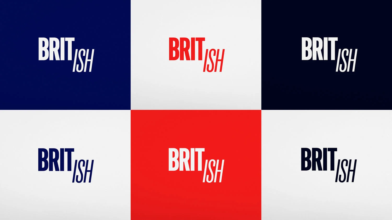
What do you get when you take an iconic legacy brand ready for an update and a desire to infuse a healthy dose of levity? A BBC America brand refresh that is eye-catching, versatile, and just the right amount cheeky, or you might say, Brit-ish.
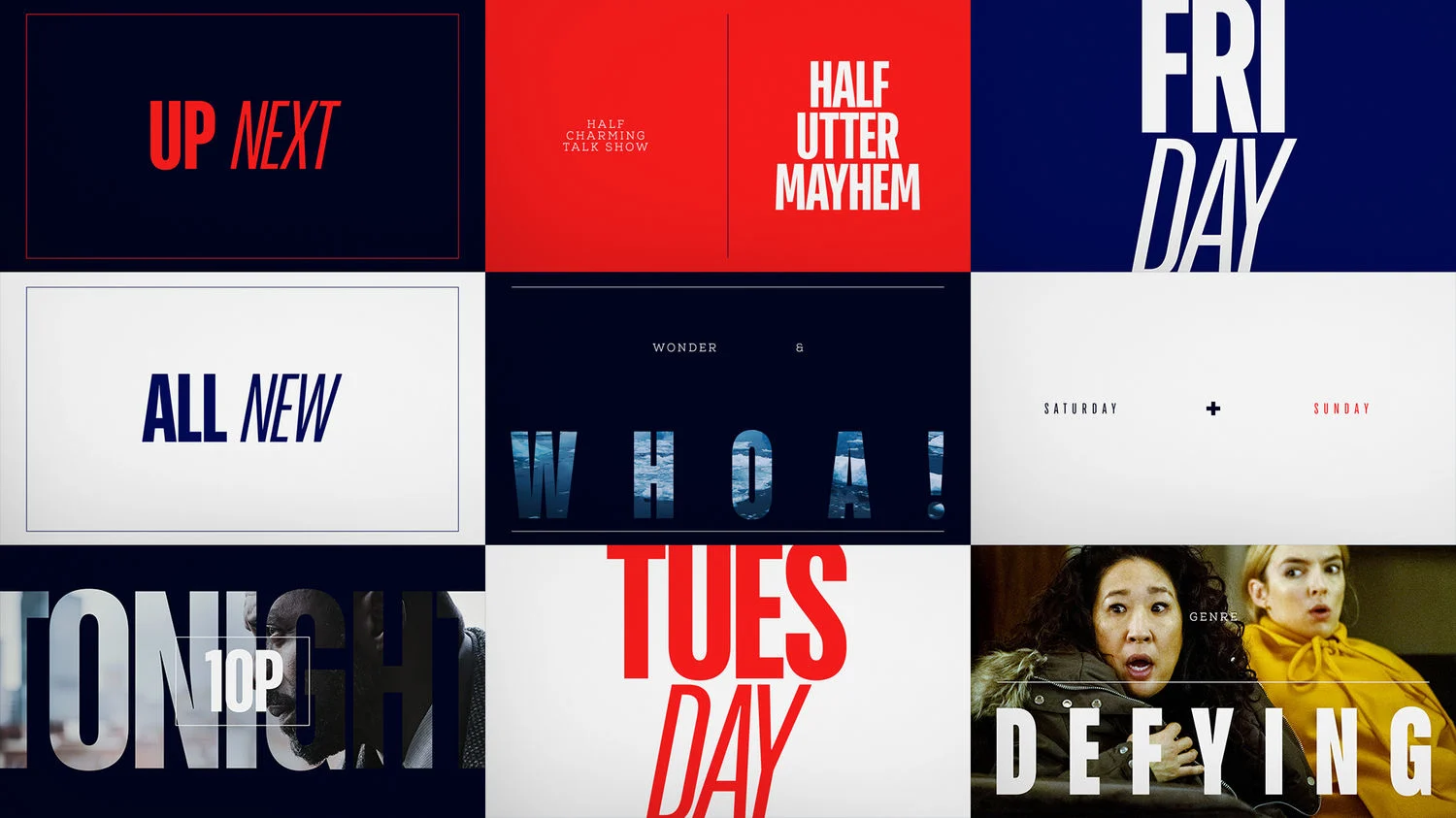
The BBC America brand has been around for a few decades and was primed for a brand update. Enter, our team at BigStar. There was a collective desire to translate the duality of the brand into one singular concept: Brit-ish. That concept was challenging, intriguing, and infused some of the signature cheeky British humor the network is known for into the final product. We got to really use our design to visualize that notion and explore the idea graphically.
The BBC America brand has been around for a few decades and was primed for a brand update. Enter, our team at BigStar. There was a collective desire to translate the duality of the brand into one singular concept: Brit-ish. That concept was challenging, intriguing, and infused some of the signature cheeky British humor the network is known for into the final product. We got to really use our design to visualize that notion and explore the idea graphically.
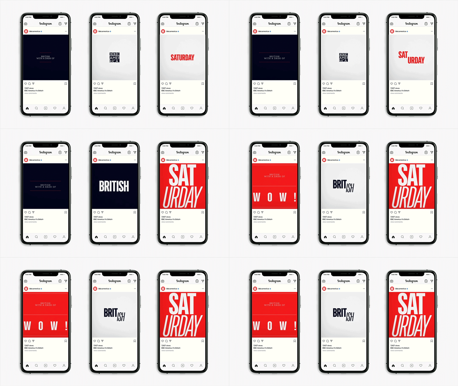
The nature of this package required an intensive collaboration with the BBCA team; this project kept us on our toes, but to be honest, it’s one of our favorite places to be. We completed the full refresh delivering everything from the logo, to a robust toolkit and style guide, all the way through to the deliverable of all on-air packaging and promo assets.
Hoop Dreams
Made for Madness
To welcome the NCAA March Madness tournament back for the 2021 season, our friends at Turner Sports came to us asking for an energetic spot to showcase the March Madness app in a fully graphic expression.
Our role was to design a fully 3D brand video that would communicate the energy and community the app provides, a departure from the celeb heavy spots of years past.
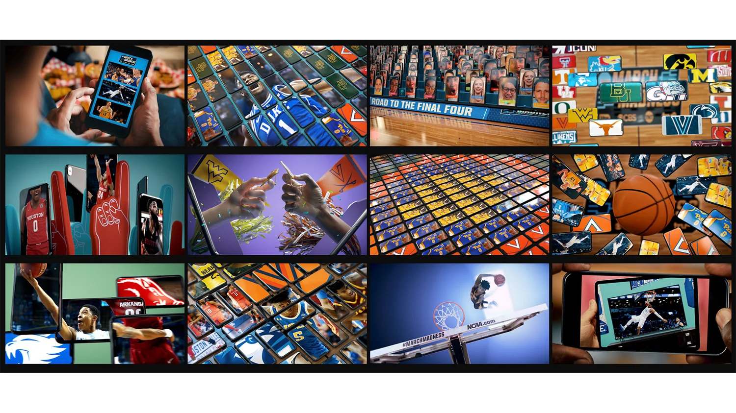

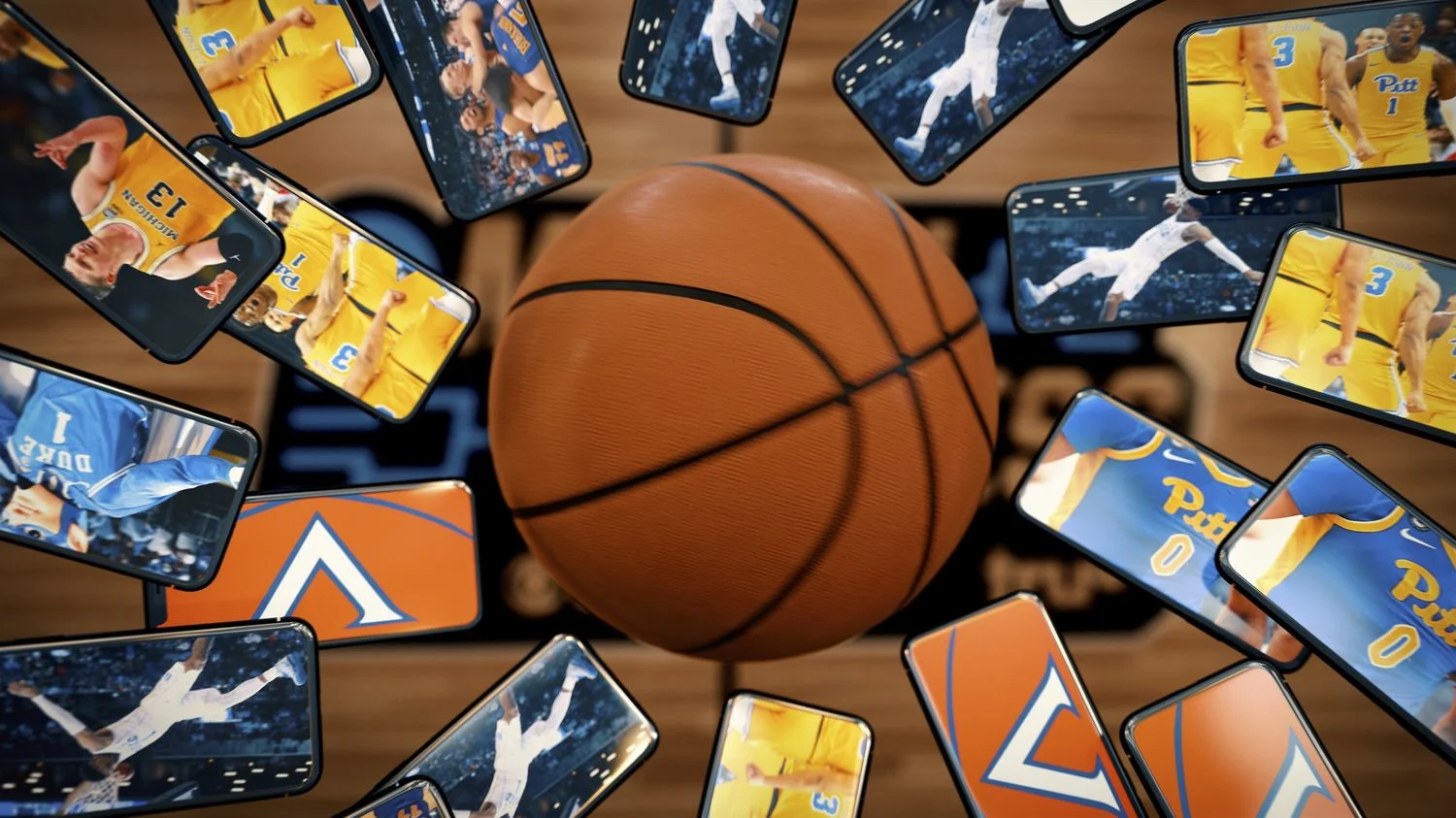
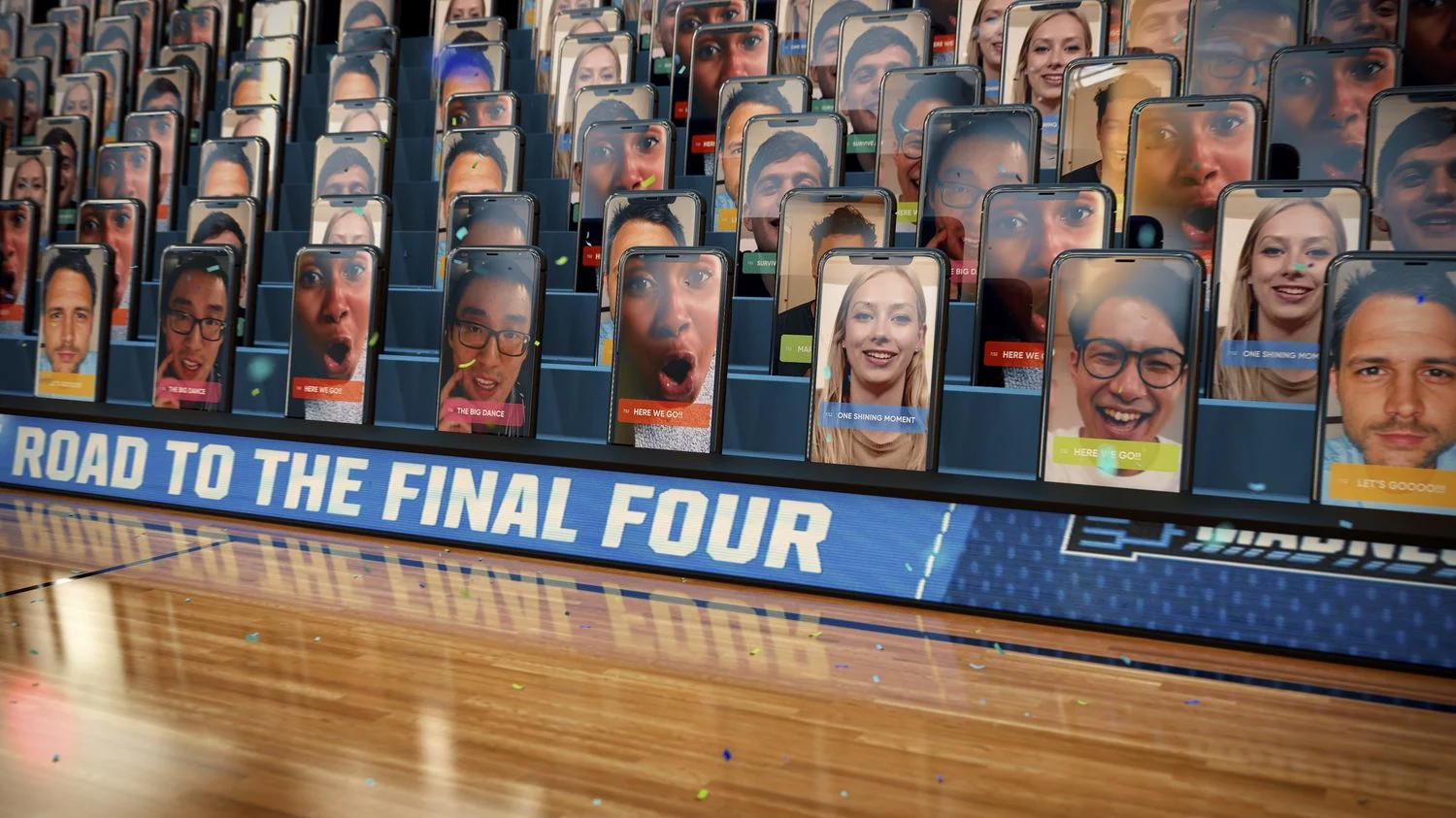
An additional element for consideration was that of course, many of those fans would be watching this year’s tournament from their homes. For us, that meant showing how the community the tournament is known for could be accessed via the March Madness app.
This is the experience that guided how the whole creative concept was built out and how the idea of being Made for Madness originated. After presenting several options, the setup featuring different compositions of animated phones transitioning in and out and creating that connection through CG hands and living rooms resonated with the client and we were off to the races.
Our team, which consisted primarily of two designers and four animators, took a highly methodical approach to the spot as a whole, each boarding out the spot shot-by-shot to ensure the energy and story were well represented in every moment. We brought in our clients at Turner for joint spotting sessions during which we analyzed each scene.

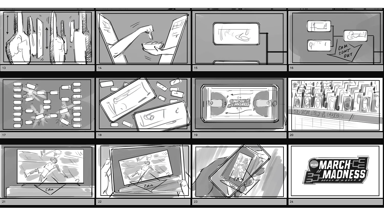

The editorial moments we selected were the result of our team effort to ensure the best shots and memorable moments of tournaments past made the spot. This highly collaborative environment enabled us to efficiently move through the promo and was a major factor in the project's success.
In the end, we delivered a :30 second fully graphic spot in addition to a number of cutdowns and spots for social use and loved seeing them all in full rotation throughout the entire tournament.
A Netflix Top 10
This is a Robbery
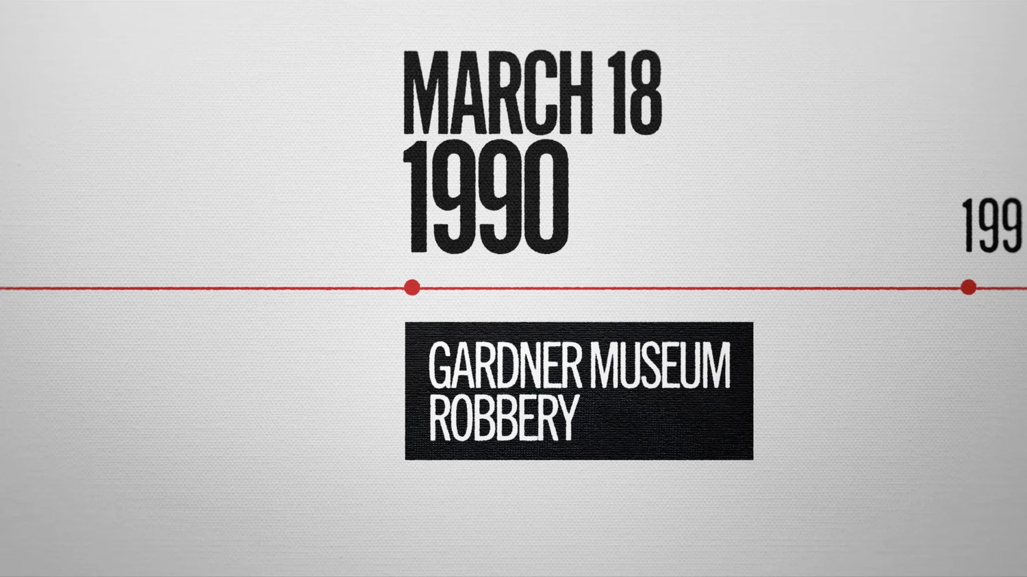
On St. Patrick’s Day 1990, two men dressed as security guards snuck into the Isabella Stewart Gardner Museum in Boston and pulled off one of the wildest art capers of all time. We teamed up with our partners at Barnicle Brothers to help tell the story of how 13 priceless paintings went missing, where they could have gone, and explore who could be responsible in the hit Netflix series, This is a Robbery.


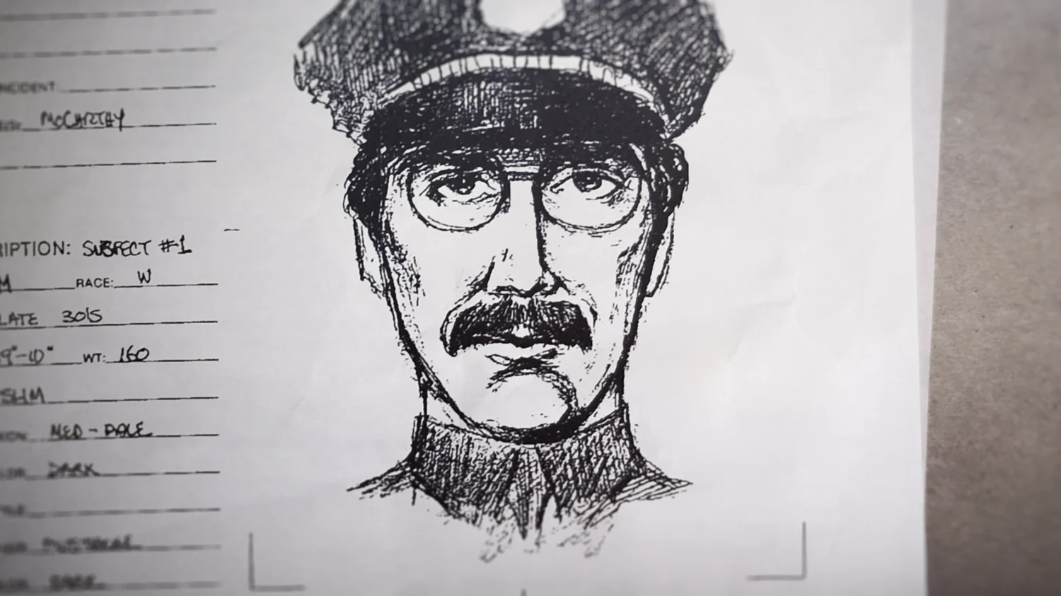
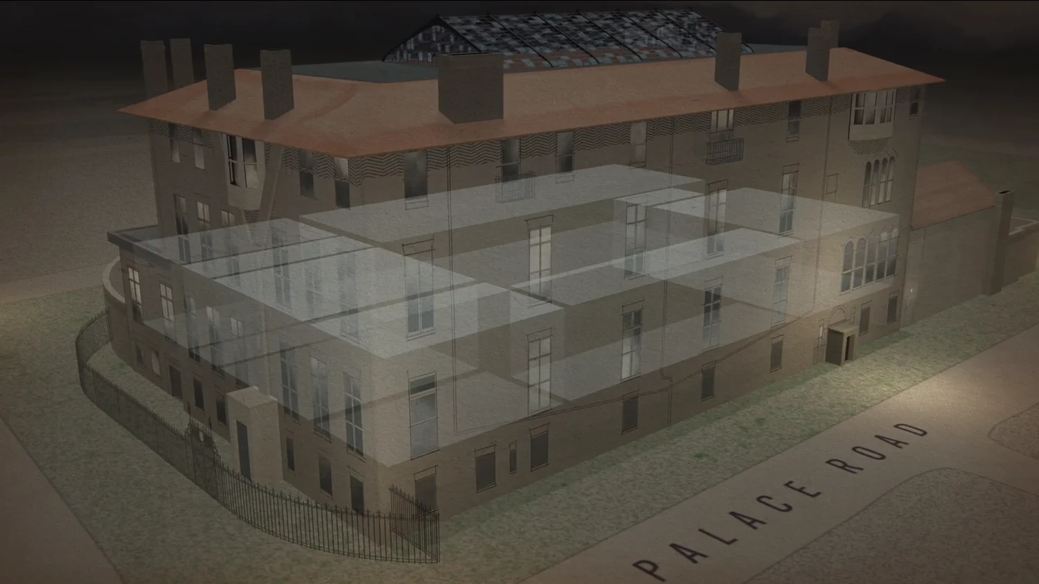
To design the series graphics package for this docuseries, we had to hit several different angles of the heist and in the process utilized a number of techniques, including some that were brand new. First, to establish an informed perspective of how the crime went down, we created suspect boards and map animations of the areas surrounding the museum to create a visual narrative to supplement the story.
Potential suspects are introduced right away in the series, starting with the security guard on duty the night of the robbery who was either oblivious or complicit in the events that led to the art theft.
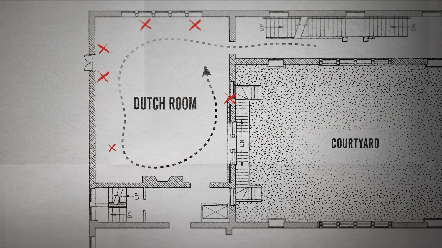
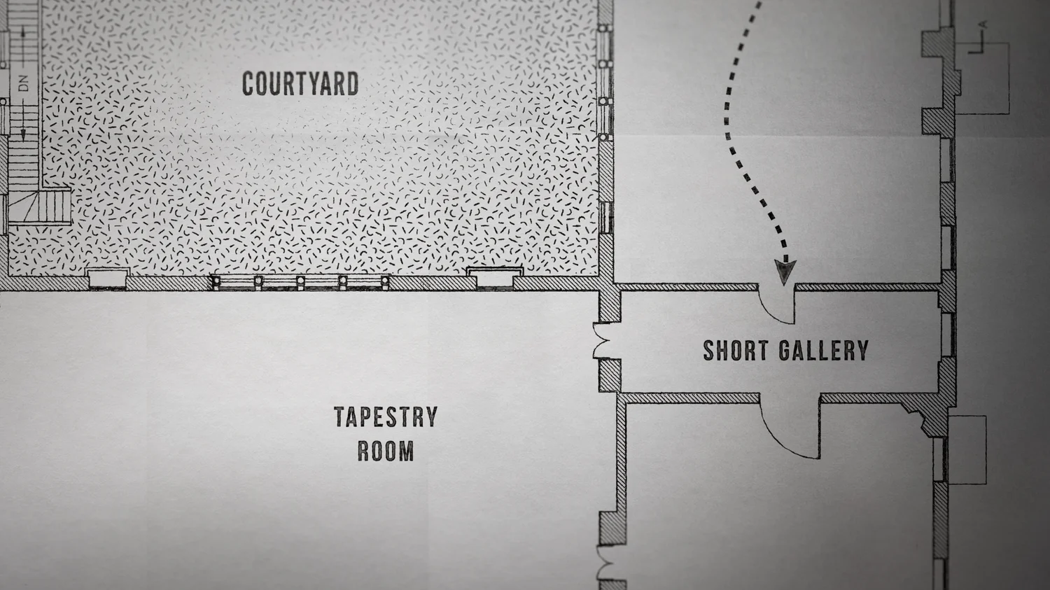
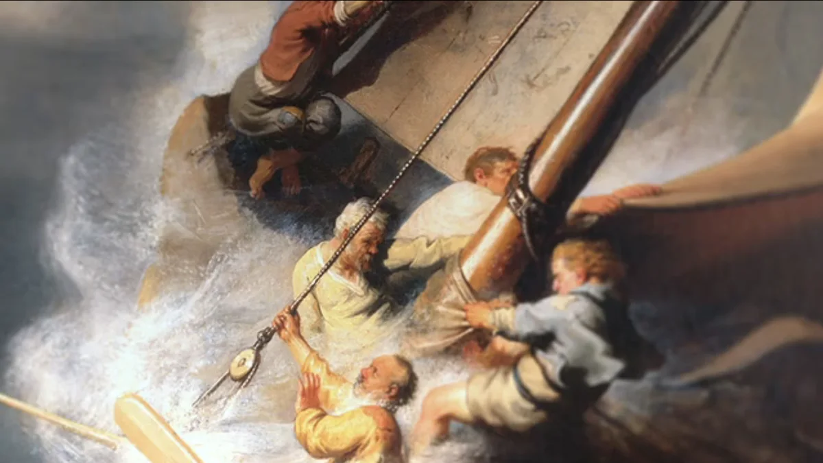
To this day, the Gardner museum leaves the frames of the stolen paintings empty as an homage to the missing art. This gave us a great opportunity to graphically composit the art back in the frames and recreate what the museum might look like with the art in place. To achieve this effectively, creative director John Leamy invented a totally new process to get the look just right:
“The technique for the painting CUs involved a number of steps. First the paintings were resized to the maximum we could achieve without loss of fidelity/resolution. Then, I did research and found some firms that do hi-res scanning and examination of old master painting surfaces and their layered and cracked topology. Using some of this data, I was able to create what are called normal maps that give a 3D surface dimension. Using the resized painting and these maps, the paintings were re-built in 3D, allowing for the placement of lighting that would reveal these surface details in a way that was convincing. Subtle play of light movement as well as camera drift was the final step. An interesting problem to solve, and I learned quite a bit about impasto (layered paint on a surface) and the decay of varnishes.”
- John Leamy, Creative Director
To create suspect boards that evolved with the telling of the story and revelations of new information, we worked intimately with the director and producers to ensure the information we were delivering was accurate and easy to understand visually. Similarly, the map animations had to be clear enough to take a viewer who has likely never been in the museum and place them at the scene in a way they can understand the layout of the museum and the path the thieves might have taken.

Thanks again to our partners at Barnicle Brothers, we had a blast working on the series and congratulations on its success!